
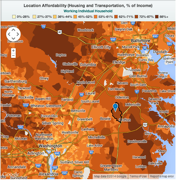
HUD’s LocationAffordability.info, which maps CNT’s H+T Index ([housing + transportation costs]/income), shows a sharp affordability divide slicing across Maryland’s suburban heartland, from the northwest to the southeast. This particular example emerged while I was researching yesterday’s Streetsblog USA post about the Citizens Budget Commission’s report citing DC, SF, and NYC as being rather affordable from an H+T perspective — but using some slightly odd figures.
Here, I’ve highlighted Crofton, Maryland, just inside Anne Arundel County, with apparently more affordable Bowie just inside Prince George’s County next door. Curiously, though, costs are $700 higher in Bowie, but it’s still deemed “more affordable.” How? Prince George’s is within metropolitan Washington, where median households have incomes $10,000 higher than in metropolitan Baltimore, which includes Anne Arundel.
The added irony: median household incomes in Anne Arundel (again, metro Baltimore) are quite high: $14,000 higher than in Prince George’s. Similarly, Howard County (Clarksville, Columbia) is Maryland’s wealthiest, with median household incomes $12,000 higher than in neighboring Montgomery (Olney, Gaithersburg). Although Anne Arundel and Howard derive much of their income from their legions of Washington commuters, they do border Baltimore County and the Maryland state legislature has designated them as part of metro Baltimore. Thus, for the H+T Index’s purpose, they’re comparatively deprived.
The H+T Index is a useful tool, but it does rely on a lot of moving data points. In this case, it’s a bit strange that the numerator (H+T costs) are defined by a very small geography (census tracts in the map, cities in the CBC report), but the denominator (income) is related to entire metro areas. While it’s true that labor markets are metropolitan in scale, it’s also true that incomes vary locally just as much as housing and transportation costs do.

Your example seems to be a valid criticism. On the other hand, the Location Affordability Index has given some thought to the issue. Here’s the explanation they offer:
“For inputs that identify characteristics the residents themselves–household size, income, and number of commuters–using actual data for each block group wouldn’t produce a very useful Index. Since people tend to live in places they can afford, using actual demographic data would produce a map where the majority of neighborhoods look more or less affordable. Instead, we have chosen eight household profiles—characterized by the number of family members, income, and number of commuters—that represent a wide range of American families, providing useful insight on affordability for a variety of different users, including consumers, planning agencies, real estate professionals, and housing counselors.”
It would be interesting and probably useful to have the option to choose smaller spatial units in the denominator. In the meantime, comparisons between metro areas should probably be limited to the CBSA scale.
Link:
http://lai.locationaffordability.info//download_csv.php?geography=cbsa