In favor of removing parking minimums downtown

With parking, at left. Without parking, at right.

[A condensed version of this post was delivered as testimony to the Zoning Commission regarding revisions to DC’s downtown zoning ordinance, Title I, on Thursday, 14 November.]

Matt Yglesias visited Chicago and was shocked at seeing high-rise parking podiums downtown, calling out parking minimums as a policy tool to “tax the poor to subsidize the rich while damaging the environment and the broader economy.”

It’s a bit unfair to pick on Chicago’s above-ground garages, since its downtown parking minimums are not terribly high by American standards. Above-ground garages sit beneath many of Chicago’s skyscrapers due primarily to the city’s high water table, which makes excavating underground parking prohibitively expensive (particularly in relation to the city’s relatively low property prices). While the downtown streetscape isn’t as dominated by parking podiums as Miami‘s (the ratios are substantially lower), the podiums definitely make a visual impression from the street and especially from the below-street-level river. The city’s increasingly stringent “landscape” requirements masked their visual impact — they’re now required to be fully enclosed, clad with similar materials to the buildings they support, and often mechanically ventilated — but it’s still pretty apparent what’s behind the fake walls.

When I lived in Chicago almost ten years ago, I chaired the Zoning for Transportation Equity Coalition, which sought to keep the city from baking a substantial increase in parking ratios into its otherwise sensitive and laudable new zoning ordinance. We enlisted several affordable-housing and environmental groups, but were not able to get market-rate developers, anxious about crossing the administration, to support us on the record. Ultimately, we succeeded in nudging the ratios down somewhat, and created such a ruckus that I think we distracted them from noticing bigger cuts in the ratios applied to downtown zones.

I am here to assure you that since then, downtown Chicago has thrived — its population has grown by 50,000, faster than any other central city in America, sales tax receipts and payrolls have both grown 50% faster than the region, and best yet, no parking riots have ensued. And here in the District, we have a more robust transportation system than Chicago: a larger rapid transit system, more walking and cycling commuters, fewer people driving to work. Furthermore, our trend lines sharply favor transportation alternatives: from 2000-2011, 1/7 of D.C. commuters switched away from cars.

For the politicians who were in charge of Chicago’s zoning rewrite process, increasing parking ratios was a no-lose proposition — an example of a free-lunch, “tax foreigners living abroad” strategy with zero present cost and only nebulous future costs. Because zoning requirements only apply to newly constructed buildings — zoning review is applied when a building permit is pulled — zoning requirements are a “newcomer tax,” levied only on speculative new construction that might or might not happen. Politicians can act like they’re “doing something” when, in fact, nothing has improved.

Similarly, advocates of parking requirements completely confuse today’s phantom “parking problem” and the zoning process. Barring wholesale reconstruction of the city, there’s no way that zoning requirements will appreciably change the parking situation today, or even in the near term. Most of today’s buildings provide parking — literally several tens of thousands of garage spaces exist downtown — and will continue to.

Even at subsidized prices, though, demand for that parking just is not high enough to fill the available spaces. Drivers’ inability to find free parking spaces outside their offices is no more deserving of a public policy response than my inability to find a free cappuccino waiting outside my office. In Chicago, one high-rise apartment developer told me that 70% of the spaces he built under the old parking requirement went unused, and the supermarket manager downstairs told me that the costly underground garage his bosses had insisted upon went empty. At newer and higher-end towers that are much further from transit (in Lakeshore East), Crain’s reports that 60% of residents forego parking spaces.

In downtown D.C., a Colliers market survey of downtown parking garages, which collectively can house several tens of thousands of cars, finds that 90% have spaces available to rent, and that garages are 20-40% empty during the day — similar to downtown Atlanta. Unreserved garage spaces downtown rent for the equivalent of $17.28/sq, ft./year, in a city where office and retail rents for well above $50, residential rents above $30, and even basement storage spaces rent for $24. The market rate for off-street parking in my downtown-adjacent neighborhood is less than half as high as in downtown, but spaces are still widely available. This pattern is consistent with the scientific literature; Bowman Cutter and Sofia Franco wrote in the July 2012 issue of the journal “Transportation Economics” that even in Los Angeles, land dedicated to on-site parking is valued significantly below the remainder of parcels.

There simply is not demand for parking that pays its own way. Thus, a parking minimum demands that the rest of us subsidize one economically infeasible land use above all others. Furthermore, a minimum demands that parking be provided, at especially high cost, within each building downtown — raising the already high cost of construction downtown, discouraging development in the most economically productive part of our region, and hurting property values in the area which pays most of the District’s taxes.

Nor will the sky fall if parking minimums go away; new buildings will still have as much parking as is necessary. A few months ago, I was at a panel where a representative from one of DC’s largest developers said that the major transit-oriented development they had under construction “was over-parked” relative to its zoning, because:

Michael Manville of Cornell University, writing about new housing built in downtown Los Angeles after an ordinance partially repealed parking minimums, found that “across all of the [exempted] rental projects, the average amount of parking installed was 1.2 spaces per unit. That’s more than the waived quota of one space.” What happened was that many of those spaces could now be provided more economically and with more flexibly, perhaps off-site or shared with other uses. What’s more, housing construction boomed — if you haven’t been lately, downtown Los Angeles has become quite lively — and the car-free housing units were significantly cheaper.

Parking is a dynamic land-use market that can be fulfilled in many ways, not only through the particularly high-cost/low-return policy lever of zoning requirements. As economist Ed Glaeser writes, “Minimum-parking requirements are a second wrong that doesn’t make a right. The original wrong is that we’ve never charged automobiles properly for using city streets, either for driving or parking.” More realistic and market-responsive prices for off-street and on-street spaces would make even more spaces readily available, with more transparency and less frustration for all. We already know that a finite supply of street parking spaces exists; it would be easy enough to allocate those via auction, splitting the supply between annual, monthly, and hourly permits. (Singapore does this with car license plates, but strangely not with their HDB parking lots.)

Better pricing can better allocate and manage the myriads of spaces that already exist: performance pricing metered and permitted on-street spaces, smarter loading zone management, sharing spaces between uses, renting out existing garage spaces, valet parking, automated garages, parking lifts, and increasingly intelligent car-sharing. The ultimate potential of better managing existing auto infrastructure is absolutely huge. If sharing can get the average American car out of the garage for just four hours a day — vs. the 1 1/2 that’s typical today — the same number of car trips could be made with 70% fewer parking spaces.

It’s these kinds of innovations that have recently started to earn the District national accolades — just today, Fast Company named D.C. the nation’s fourth-smartest city largely because of our increasingly smart transportation infrastructure. This proposed revision to the zoning ordinance can spur further innovations, increase productivity, save money, and might even help us exercise and lose weight.

DC height critics say Paris is pretty… but building Paris was not a pretty process

Charles Marville, Avenue de l'Opéra, 1877, albumen print, courtesy of Editions du Mécène
Demolition near l’Opéra in Paris, 1877, photo by Charles Marville

Those of us who imagine a Greater Greater Washington understand that the region’s population growth is a force that we can harness for great good. More people will mean more of the people and places that together make a great city: more shops and services, more exciting and innovative companies, more tax revenue, more frequent transit service, and yes, more buildings.

Yet many in Washington not only deny that growth has benefits, they deny that it is occurring, and deny that it will have tremendous consequences for our built environment.

One oft-repeated line heard from the (small-c) conservative crowd is that height limits have worked to keep Paris beautiful. That comment ignores a lot of painful history: the mid-rise Paris that we know today was built not by a democracy, but by a mad emperor and his bulldozer-wielding prefect. As Office of Planning director Harriet Tregoning said in a recent WAMU interview, “Paris took their residential neighborhoods and made them essentially block after block of small apartment buildings… if we were to do that in our neighborhoods, we could accommodate easily 100 years’ worth of residential growth. But they would be very different neighborhoods.”

A haunting exhibition of photographs by Charles Marville, currently on view at the National Gallery of Art, offers us a glimpse at how this change manifested itself in Paris. Marville was hired by the city government to document the systematic demolition of central Paris’ low-rise neighborhoods, the construction of new mid-rise neighborhoods (the ones we know today) in their stead, and the widespread displacement of the center’s low-income residents to the urban fringe — perhaps culminating in the bloody Commune revolution of 1870. (Numerous books have been written about the era, notably “Transforming Paris,” by David Jordan.) There were technological limits on buildings in that era, too: elevators were slow and expensive, and the new water mains could not supply satisfactory water pressure to the upper floors of many buildings.

Not dissimilarly, downtown DC’s horizontal march has steamrolled numerous low-rise neighborhoods in its wake, from Chinatown to Foggy Bottom. Now that only a few blocks are left for downtown to grow into, office buildings are muscling towards Shaw. This is only natural for a mid-rise city: Paris’ mid-rise urban fabric superimposed on DC would spill outside the diamond, vastly larger than the existing downtown.

That path of destruction is why most other growing cities in this century (i.e., built-out but growing central cities, from London and Singapore to New York, Portland, Toronto, and San Francisco) have gone the Vancouver route and rezoned central industrial land for high-rises. This method allows them to simultaneously accommodate new housing, and new jobs, while keeping voters’ single family houses intact. By opposing higher buildings downtown, DC’s neighborhoods are opposing change now, but at the cost of demanding far more wrenching changes ahead: substantial redevelopment of low-rise neighborhoods, skyrocketing property prices (as in Paris), or increasing irrelevance within the regional economy as jobs, housing, and economic activity get pushed further into suburbs that welcome growth.

Among large North American cities, only Toronto has joined DC in making a concerted effort to redirect growth into mid-rise buildings along streetcar lines — and only as an adjunct strategy in addition to hundreds of high-rises under construction. (The two metro regions are of surprisingly similar population today.) Yet there, just like around here, neighborhoods are up in arms at the very notion.

DC cannot put a lid on development everywhere — downtown, in the rowhouse neighborhoods, in the single-family neighborhoods, on the few infill sites we have left — and yet somehow also accommodate enough new jobs and residents to make our city reliably solvent, much less sustainable. The sum of remaining developable land in the city amounts to 4.9% of the city, which as OP demonstrates through its analysis, cannot accommodate projected growth under existing mandates.

Something will have to give. A good place to start is a loophole-ridden law imposed back when DC was a protectorate and when Greater Washington counted fewer residents than today’s greater Asheville or Davenport.

The Office of Planning has suggested a reasonable framework for a subtly revised Height Act that can accommodate growth and change while preserving the city’s cherished urban design and historic neighborhoods. Adapting the rigid 130′ cap to a street-width rule maintains the Height Act framework along our ceremonial avenues — where our city’s namesake actually set a height minimum. Along streets like L’Enfant Promenade, Washington had the right idea: taller buildings will better frame vistas. Beyond the L’Enfant City, the Comprehensive Plan and zoning ordinance will continue to ensure that most buildings never reach the 90′ Height Act maximum, but the city will have the flexibility to adapt to evolving construction techniques and special opportunity sites.

As DC re-adjusts to a new century of urban growth, after a lost generation of population decline and disinvestment, inaction poses a far greater risk than action. Paris’ combination of horizontality and verticality is undeniably beautiful, but its unique form resulted from a peculiar historical process that I would not wish upon an American city today.

(The District of Columbia Council is accepting written testimony about the Height Act through next Tuesday.)

a version of this post is cross-posted at GGW

Going with the flow: how Washington Channel’s mechanics impact its relative water quality

This semester, I’m taking a Natural Resources class through Virginia Tech about understanding local watersheds, wherein I’ll be researching and posting knowledge about the Washington Channel. You can explore the other watersheds that my classmates are investigating over at the class blog’s page.

In this installment, I’ll take a closer look at how the channel functions today, and what that means for its water quality. Other posts can be found using the tag watershed.

Last week, I examined how the silty Potomac started to clog the harbors around Washington, and mentioned how that resulted in the 1896 construction of the Tidal Basin and the Washington Channel. Today, we’ll investigate in some more detail just how the basin and channel work.

The satellite photo currently shown on Bing Maps appears to have been taken at low tide, when the Potomac River flows more or less as it always has, carrying fresh water east to the Chesapeake Bay and Atlantic Ocean:

Washington Channel: low tide

Note the high sediment levels in the Potomac, as indicated by its brownish color — it appears to carry more sediment than the Anacostia. I’ve highlighted the rivers’ silty water flows with greenish arrows.

At high tide, the picture looks very different, as the silty rivers collide with waves of clearer, darker ocean water racing upriver:

Washington Channel: high tide

The Tidal Basin-Washington Channel system uses the tidal surge to activate a pair of one-way gates. Imagine the Tidal Basin as being bound by two sets of doors that both only open inwards. The first set, the Potomac inlet gate, is at the Basin’s southern end: facing the flow of tidal water but perpendicular to the river’s flow. When the tide rises, the pressure of water flowing upstream pushes open the inlet gate, filling the relatively low basin with 250 million gallons of water:

Washington Channel & Tidal Basin at high tide

When low tide occurs, water recedes away from the Tidal Basin at the Potomac gate. The now-higher water in the basin tries to escape back out to the Potomac, but because those gates only open inwards, the water instead pushes the gates shut. (Water only pushes, not pulls.)

Meanwhile, at the Tidal Basin’s eastern end, an outlet gate leads to the Washington Channel. There, the gates open from the Basin to the Channel: they’re pushed open when the tide falls away from the Basin, spilling those 250 million gallons into the Channel, and they’re pushed shut when the tide rises.

Since the Channel is scoured during both the high and low tides, and is fed by the clearer tides and not by the muddy Potomac, sedimentation is no longer a problem and the channel retains navigable depth without the need for dredging. And since the Tidal Basin is fed by the tides — it’s always “high tide” in the Channel — the water within Washington Channel more closely resembles that of the Chesapeake Bay than the Potomac River next door. Thus its water is relatively clean, which is curious for a water body within the District of Columbia.

As a habitat, the Channel more closely resembles the brackish downstream Potomac than any of the neighboring freshwater rivers and streams. Fishermen know this, and set up along its banks to catch fish that have been swept upstream by the tide:

Washington Channel & Tidal Basin at high tide

In further installments, I’ll take a closer look at the shorelines, adjacent land use context, drainage, and water quality measures within the Channel.

Quick bibliography: shared streets

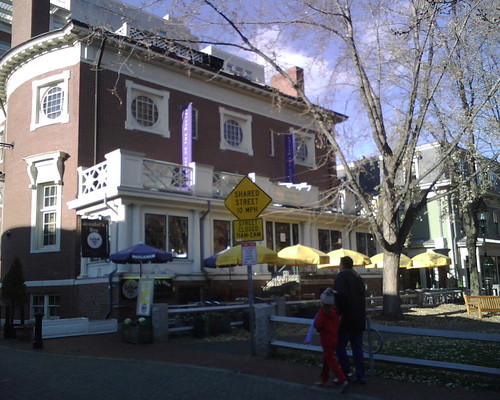
Shared streets came up a few times in discussion at Place Summit this past weekend — praised as a “complete streets” solution that’s slower, narrower, more urban, and less auto-oriented, instead of the wider roads (with bike lanes!) that many DOTs have ended up with. It turns out that the NACTO Urban Street Design Guide does offer design guidance for both residential and commercial shared streets, and for “green alleys,” their term for a shared alley.

sharing is caring

Katherine Watkins from Cambridge, Mass. presented at the 2012 NACTO conference on her city’s experience with three shared streets — one side street and one alley off Harvard Square, and one residential street. Her presentation has photos and example municipal code clarifying behavior on the shared streets: drivers must yield to pedestrians at all times, and the speed limit is 10 MPH. The NACTO guide also mentions a residential shared street in Santa Monica.

Cady's Alley, rainy day

Several experiments with shared streets are underway in the Washington, D.C. area. Most famous is Cady’s Alley, a thriving destination for high-end design retailers tucked between busy M Street and the C&O Canal in Georgetown. Developers have long struggled with how to activate the deep block of former warehouses on that block (most famously with the white-elephant Georgetown Park mall) , and here Anthony Lanier, the impresario of Georgetown real estate, has successfully created an environment that simultaneously honors the area’s 19th-century industrial heritage, incorporates cutting-edge design, provides an inviting and durable pedestrian environment, and makes so much money that he’s at it again. (I didn’t know until now that Leopold’s Konditorei was a loss leader, but it could have fooled me: it’s a fantastic place-maker and a treasure.) Approval of the street design was facilitated by the fact that it’s an alley, and therefore not subject to the usual street design standards — pedestrians aren’t expected along alleys, and therefore sidewalks don’t need to be provided.

Update: DDOT proposes a shared street (see option 2, “Flex space”) as one option to improve an existing multiway boulevard’s service lane.

Wales Alley via Google Street View

If all goes according to plan, Virtue Feed & Grain in Alexandria will soon sit at the intersection of two public shared streets: Wales Alley, which it recently converted into a shared ROW, as well as Union Street on the other side. Toole Design Group is leading the study process.

Other local shared streets have benefited from being built as private drives:
Brookland Arts Walk

Bethesda Lane

Mosaic District

From top to bottom, these are the Brookland Arts Walk and Bethesda Lane, both pedestrian streets which are open only to delivery vehicles, and District Avenue at Mosaic in Fairfax County, a more conventional street that happens to be curbless. On a much larger scale, the Wharf, a 3.2 million square foot mixed-use development, promises that all of its internal circulation will be along shared streets. (Both the Wharf and Georgetown have to undergo federal review, via the Commission on Fine Arts.)

L Street Shared Street, photo by Jacqueline Dupree/JDLand

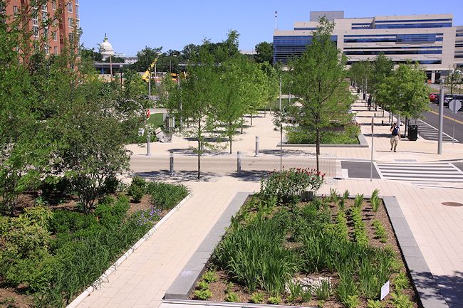
Perhaps more interestingly, Washington Canal Park, across from the US DOT headquarters, converted the two side streets running across the site into curbless streets with lighted bollards. OLIN was the landscape architect for this Sustainable Sites Initiative pilot project.

A few other experiments have occurred around the country:

Market Square

Market Square in Pittsburgh (PPS-inspired redesign)

look ma, no curbs

Flanders Festival Street in Portland’s Chinatown (technical summary by Ellen Vanderslice for ITE)

Pearl Mall

In Columbus, Ohio, Pearl Alley went from being a convenient cut-through (in a city of excessively wide streets), to a popular summer farmers’ market, to a small-scale retail artery along a shared street.

Of course, they’re also very common outside the United States, including:

Walter Hardwick Avenue

Vancouver, B.C, where this woonerf is an integral part of what made this the first LEED ND Platinum neighborhood

Stephen Street Walk

Calgary, where partially re-opening a pedestrian mall was integral to its regeneration

shared street

Throughout Japan (this is in the small mountain city of Matsumoto), where shared local streets might even constitute the majority of street frontages.

Mud becomes concrete: Washington Channel’s history, told through maps

This semester, I’m taking a Natural Resources class through Virginia Tech about understanding local watersheds, wherein I’ll be researching and posting knowledge about the Washington Channel. You can explore the other watersheds that my classmates are investigating over at the class blog’s page.

In this installment, I’ll take a closer look at how the channel came to be a (sort of) discrete watercourse, to provide some context for later posts about today’s land and water quality. Other posts can be found using the tag watershed.

From Montreal to Providence to Trenton to Richmond, many of the East Coast’s great cities arose astride the “fall line,” an imaginary line along which its many rivers tumble from shallow rapids in the hills to slow, wide, sometimes brackish coastal estuaries. In an ocean-going era, such a location ensured easy access for oceangoing commercial boats, fresh river water, produce from farms upriver and fisheries downriver, and later to water power from the rapids or waterfalls alongside — all without the considerable downside of a coastal location’s vulnerability to frequent Atlantic storms.

Spillway
[Minneapolis, built astride the falls of the Mississippi, could be considered the most interior of the East Coast’s fall line cities.]

Washington, D.C. is among these fall line cities, and its constant attempts to reshape the Potomac River’s banks also show the vulnerabilities that fall line geology also brings. Above Washington, the Potomac speeds through a narrow gorge, tumbling over its majestic Great Falls and past the high bluffs of wealthy towns like McLean, Potomac, and Georgetown. At Washington, three flows of water conjoin: the slower and broader Potomac, Atlantic seawater that tides pull all the way up the Chesapeake Bay and the Potomac estuary (with tides rising to 3.5′), and several surface flows. The comparatively flat topography of the L’Enfant City results from it resting upon a “shelf” of sediment brought there by the Potomac over time. This 1861 bird’s-eye view map by John Bachmann (from the Boston Public Library collection) plays up the topography, dramatically showing how the character of the Potomac valley changes at Washington:

Bird's eye view of part of Maryland, Distr of Columbia and part of Virginia

Several surface flows join the Potomac at Washington, notably the Anacostia River, Rock Creek, and Four Mile Run, but also several streams that have since been buried like Tiber Creek and James Creek. (David Ramos has compiled an impressive map of these buried streams.) From the very beginning of the city in 1790, plans were made to tame these streams for human uses like shipping. A map from the 1790s, drawn by John Russell, shows how city fathers, Pierre L’Enfant among them, conceived a system of drainage improvements. These canals were straightened channels based upon the east-west Tiber Creek and the north-south James Creek, both arising roughly where Garfield Park is today at the foot of the Capitol. The map also shows the outlines of the deeper, more easily navigable channels within the mostly shallow Potomac:

Plan of the city of Washington[...]

This idealized 1852 view, published by E. Sachse, illustrates the canals in an improbable shade of blue:

Shortly after Washington was founded, the Potomac’s plentiful sediment became a problem for the growing city. Land clearance for forestry and farming upriver combined with increasing levels of urban pollution dumped into local surface waters, making the water noxiously polluted — particularly during low tide, when pollution festered in exposed tidal marshes. The insalubrious tidal marshes at the mouth of Tiber Creek, beginning at the foot of the White House, appear to have given rise to the widespread myth that “Washington was built on a swamp.” The marshes are visible in these digital reconstructions of the 1791 shoreline:

Then and now: Washington Channel

Original and present shorelines of Potomac Park

The sediment buildup also threatened the city’s access to maritime trade. Given the marshes along the Tiber, the new city’s only shoreline adjacent to a deepwater channel within the Potomac was along its southwest waterfront. Wharves sprang up along Maine Ave. SW, landing fish and ferries that went to Alexandria and points beyond. In this process, this shore gradually urbanized and gained a “coat of armor” as buildings crept up to the water’s edge, as shown in this 1883 drawing by A. Sachse:

Private property owners’ interventions to shape the shoreline would soon be dwarfed by Congressional plans, particularly as the sediment threatened the relatively deep channel fronting Southwest’s wharves. Engineers (notably Peter Conover Hains) from what would become the Army Corps saw an opportunity to tame the city’s shoreline, preventing severe floods like that of 1881 from reaching the city’s core. Meanwhile, planners saw the potential for new parks — simultaneously adding land to the capital of a fast-industrializing country, meeting a post-Civil War national zeal for commemorative monuments, and providing Washington with a vast expanse of parks at its doorstep (as the fin-de-siecle era’s vogue the City Beautiful demanded).

This 1888 map by E. Kurtz Johnson depicts an early “cloverleaf” plan by Hains for filling in much of the Tidal Basin area, leaving a series of small pools that would be used to flush a new Washington Channel downstream:

In 1901, the City Beautiful reached its apogee here in Washington with the McMillan Plan. Shortly thereafter, the canonical birds-eye view of Washington had shifted 270 degrees; instead of placing the Capitol dome front and center with the filthy Potomac River in the distance, now bird’s-eye views proudly showed off the carefully sculpted shoreline, with its large and scenic Tidal Basin, an urban shoreline for the Washington Channel, and probably many more trees in Potomac Park than existed at the time (1916, drawn by H. H. Green):

Many of these maps courtesy of the Historic Print & Map Company, via DC Vote’s archive of Washington, DC, Historical Maps; high-res PDF versions can be downloaded there. Others were drawn from a Washington Post Magazine feature by Scott W. Berg, featuring mapping work done by architect Don Hawkins and Dan Bailey/UMBC Imaging Research Center.

Updated 17 May 2015 to fix broken links. The USGS recently made turn-of-the-century maps of DC available (the 1:62,000 scale is best); most show the Channel’s “final” boundaries, but are useful for observing urban growth and other topographical features.

Shorts: getting to the office, and its implications for developers

1. Jonathan O’Connell asks, “With no office tenants and no financing, is the Southwest Waterfront redevelopment in trouble?”

The trouble they’ve had in raising capital underscores the importance of a good phasing strategy. The Wharf needs to start with a big bang for both top line and bottom line reasons:
– the retail won’t pay out without a critical mass of activity on the site; indeed, the 140K sq. ft. proposed for Phase 1 is at the low end for a viable lifestyle center
– the large amount of underground infrastructure (two levels of parking, new seawall, parks) that must be built before the first building pays out would be cost-prohibitive for a smaller project.

2. Earlier from O’Connell, a sign of how much the local market has embraced urbanism (with almost none of this space receiving local subsidies):

Of the 5.5 million square feet of office space under construction in the region, about 4.6 million of it, or 84 percent isn’t just near a Metro station but within a quarter mile of one, according to data from Jones Lang LaSalle, CoStar Group and Delta Associates.

The trouble is that each one of these buildings feeds off of Metro’s positive externality of greater access, but any one building can only make a relatively small contribution towards that transit infrastructure. Even the BIDs and special taxing authorities set up around most of these WUPs focus primarily on low-cost, high-return placemaking projects rather than the much more expensive, long-term work of buliding value with transit. Meanwhile, buildings that attempt a greater level of infrastructure investment, like those at the Wharf, can’t get the running start that they need. Areas with that transit infrastructure in place thus have an edge over those where it remains (and, given scarce funds, will likely still remain) to be built.

Some have taken this to mean that retrofitting suburbia will be necessarily be too expensive a proposition to be economically feasible. On that point, I only half-agree: there are a few cities, primarily in the Rust Belt, where intact and high-quality urbanism is cheap enough to feasibly redevelop. Yet with a growing population — America’s population will grow by about 140 million between 2000-2050, nearly matching the entire 1950 population of 150 million — that’s now concentrated in an entirely different set of cities, retrofitting may well prove to be the cheaper alternative.

3. Michael Andersen in the Green Lane Project notes that it isn’t just Metro access that moves office space:

Kathy Card, the general manager of two office buildings in DC’s fast-changing Chinatown, said last week that she doesn’t ride a bike herself. But watching traffic at the bikeshare station at 8th and H, she said, has convinced her that some of H Street’s four auto travel lanes and two parking lanes should be repurposed for protected bike lanes. Dedicated bike infrastructure is what’s needed, Card said, to help her buildings appeal to the private-sector firms she’s marketing to. “There’s plenty of ability to put bike lanes in,” Card said last week. “Obviously the demand is there.”

4. So perhaps it’s only appropriate that the latest MoveDC plans, leaked via DCBAC, floats the idea of cycletracks on just about every arterial in the city: Independence, Constitution, Connecticut, Massachusetts, Rhode Island, Florida, Bladensburg, Minnesota, Alabama, N Capitol, S Capitol, U, 9th, 14th, etc. — oh, and a bike bridge to Alexandria, too.

5. A generation ago, Joel Garreau wrote in “Edge City” about how one axiom shaped everything about suburban office parks: four car parking spaces per thousand feet of office. Yet today, both numerator and denominator have changed beyond all recognition: the cars are gone and the offices are smaller. As reported by Laura Kusisto, the conversion of Brooklyn’s vast Watchtower printing plant into loft offices proposes a bike parking ratio of 8.3 bikes per 1000′ of office. The resulting indoor garage will house 5,000 bikes — 15-16X larger than dedicated bike stations in Chicago or Santa Monica, and undoubtedly as a result requiring special accommodations like ramps. It would be interesting to know whether bike parking is a way to soak up the dark space in the middle of the floors (that would be convenient) or if they’re warehoused in a basement.

6. Besides, who ever uses that much car parking at their suburban offices? Even the car lobby (!) would rather have cute farmers markets than parking lots:

Attitudes towards race and space: another red-blue divide

Just attended a CAP/PolicyLink event about a new poll examining American’s attitude towards rising diversity. The report raises some interesting implications about the intersection of race and place — particularly since attitudes about diversity play out very differently between diverse, growing coastal gateway cities vs. the slower-growing interior.

– The coast/interior divide is quite sharp. The poll analysis used responses about various positive or negative aspects of diversity to generate an “openness index.” The Mid-Atlantic (NY/NJ/PA) and West Coast were the only two regions to have an index score above the national average, and by large margins (7-8%). On the other end, the South Central regions had index scores 6-10% below the national average, and the mountain west was 4% below the national average.

– Questions related to place generated very sharp differences between age groups. Respondents were asked whether they agreed with a series of arguments, both good and bad, about diversity. Of these questions, answers related to places had a sharper age divide than any other question asked, perhaps pointing to very different experiences between young and old when dealing with diverse public spaces. Millennials are the most diverse, best-educated generation in American history, and their welcoming attitude towards a diverse population is one of the less-explored aspects of their shift towards city living.

Asked whether increased diversity was good because “Diverse workplaces and schools will help make American businesses more innovative and competitive,” 75% of 18-34s agreed, whereas only 60% of 65+s agreed; 69% agreed overall.

Asked whether increased diversity was bad because “Crime and problems in our neighborhoods will go up,” almost half of all respondents (47%) agreed. Responses varied relatively little by race, with 47-49% of Whites, African Americans, and Latinos agreeing. However, three groups (all of above-average urbanization, and therefore seemingly with more to lose) stand out as much more optimistic about diverse neighborhoods:
– 37% of 18-35s agreed (vs. 58% of 65+s)
– 32% of White college grads agreed (vs. 55% of non-graduates)
– 38% of Asian Americans agreed

– Some hint of how this may play out in the metropolitan political sphere can be seen in the New York City & Los Angeles mayoral elections:

Candidates who can embrace both their personal racial transcendence and an equitable-growth platform are well-poised to triumph in regional politics.

Brighter isn’t always lighter

Which of these stations is better lit?

Canada Line Station

TransLink system lighting standard for subway platforms: 4 foot-candles

IMG_2524 - Washington DC - WMATA Metro Chinatown Station - After Genesis concert
WMATA system lighting standard for subway platforms: 10 foot-candles

Believe it or not, WMATA hardly has the darkest stations in the business. I was amazed to learn recently that Vancouver’s transit agency specifies platform lighting 60% dimmer than WMATA’s: their standard is 4 foot-candles, vs. 10 foot-candles for WMATA. I usually read when I’m aboard transit, and whereas I have to seek out light on Metro subway platforms, I’ve never thought twice about the brightness on TransLink platforms (admittedly, I’ve spent much less time on the latter, partly due to the automated system’s startlingly low headways).

The difference is that TransLink also specifies high-reflectance, light-colored walls and floors, and directs light into occupied areas so that they feel much brighter. With “passive illumination,” it’s not just how much light is used, but also what the space does with that light. Seemingly minor increases in reflectance for surfaces like walls and ceilings (particularly for indirect lighting scenarios) proportionately increase the brightness one can achieve with a given amount of light.

By comparison, much about the classic Metro station design thwarts attempts at improving lighting — and intentionally so, in fact. Our standards of brightness have increased, partly because illumination has become so cheap. Yet the dark material palette chosen for the stations (unpainted concrete walls and ceilings, burgundy tiles, chocolate brown panels, even the bronze railings) absorb both what little light is added and dirt, which further darkens the stations over time.

Metro points to the efforts that it’s taken recently, including regular power cleaning of the concrete station vaults, existing efforts to add fixtures, and a system-wide re-lamping with more modern (and thus brighter and more energy-efficient) equipment. The fruits of these can be seen at stations like Judiciary Square, which does indeed seem like a beacon of light compared to others in the system.

Yet using more reflective materials can also improve station lighting. That’s the gist behind recent changes that Metro announced to the Bethesda station (previous GGW discussion here), like replacing brown metal panels and concrete walls with brushed metal and clear glass. These changes will definitely help, but a more comprehensive approach could look at other changes that can improve lighting without dramatically impacting the stations’ canonical appearance.

  • A clear polymer coat (not paint) could increase reflectance of existing concrete surfaces, reduce porosity and thus the problem of embedded dirt, and make cleaning easier. Painting the station vaults has proven controversial throughout Metro’s history: Zach Schrag’s book The Great Society Subway points to a 1968 disagreement between the designers Harry Weese and William Lam as to whether to paint the vaults, and notes Weese’s “commitment to ‘pure structure in plain concrete’ ” in criticizing a 1990s decision by WMATA to paint some vaults. Yet materials advances now mean that light reflectance surprisingly has less to do with color as one might expect: a darker color with a slight gloss reflects more than a brighter color with a dull finish.
  • The existing fluorescent tubes are recessed within wells that are out of sight, beyond the platform edge or between the tracks. Since these surfaces are so close to the light sources, small changes here will result in big changes throughout. Cleaning and brightening surfaces within these wells, adding reflectors below the tubes to “catch” light that’s currently pointing downwards, moving wire conduits so that they’re below lights instead of blocking them, and replacing bronze-colored diffusers above the between-track tubes with clear plastic diffusers, will all result in more light to reflect upwards into the station.
  • Acoustic panels in coffer recesses can be brighter. These panels cover a surprising amount of the vaults’ surface area, but because they’re literally in the concrete’s shadows, we don’t tend to notice them very much. These, too, accumulate dirt and dust over time, and as they’re replaced their reflectance could be increased. The new Rosslyn entrance has highly reflective panels embedded within its coffers, which I didn’t even notice the first few times I walked through it.
  • Similarly, the drop-ceiling tiles underneath station mezzanines can be replaced with tiles that reflect more light. Given the low ceiling heights in these spaces and the fact that they’re largely hidden from view, a more ambitious upgrade could replace these with ceiling tiles with embedded LED lamps, reducing both shadows and glare in these areas while improving efficiency over the existing can lights. LED ceiling tiles might sound gaudy, but look no different than the fluorescent panels embedded in most office drop ceilings.

Attention to these details can ensure that the maximum possible amount of light is available within Metro’s subway stations, improving energy efficiency, safety, comfort, and accessibility without altering their iconic appearance.

[A version of this is cross-posted at Greater Greater Washington]

Think where, not what, for best results with TOD (BRT or otherwise)

Transit oriented, but...
North America’s largest BRT system somehow isn’t a poster child for TOD.

1. Transit belongs on streets, with the people.

A recent ITDP report made a big splash about transit oriented development, some of which has happened along busways. Some media outlets, e.g., Eric Jaffe in The Atlantic Cities correctly reported the report’s amply demonstrated finding, explained over 56 pages, that good TOD outcomes depend on a lot of “necessary but, in and of themselves, insufficient” pro-development policy factors: comprehensive plans, small area plans, capital investment plans, housing investment, institutional support, a favorable regional economy, and a favorable sub-regional economy.

That last factor is presented curiously absent any discussion of the micro-level geography of the land immediately adjacent to the transit line. Together, though, these factors essentially boils down to the old real-estate adage of “location, location, location” — and seem to explain much of the difference between the different case studies’ different TOD outcomes. In fact, just the urban pattern along the route appears to perfectly* correlate** with the observed TOD outcome via their odd metric of “dollars of development per dollar of transit investment” (see this spreadsheet for details).

The best mass transit alignments go where the mass of people are: connecting a downtown to a strong and promising midtown, along an established mixed-use urban street level corridor. Transit ROWs in highways, freight RR corridors, etc., almost universally perform poorly at generating TOD.

* The one exception is Phoenix, which has weathered an economic depression since its light-rail opened.

** This thesis could be empirically tested through GIS analysis, as well (looking at block sizes, parcel sizes, or land use mix adjacent to the transit lines), but I’ll leave that to someone else. Aggregating data from that many cities takes more time and computing power than I can spare now.

2. The report’s fundamental flaw, and what it didn’t say (regardless of what you’ve heard).

Okay, now a pointed criticism of the report and subsequent reporting. Sadly, many other media outlets fell for a much more simplistic reading of the report, zeroing in solely on the report’s unsubstantiated, and actually never clearly stated, claim that buses are a superior value to trains in spurring TOD. The “dollars of development per dollar of transit investment” metric relies entirely on hearsay for both its numerator and denominator, rendering it useless. The footnotes mention an attempt to standardize the cost figure (denominator), but not the numerator, and ultimately local transit agencies got to define both figures as they pleased.

Euclid at PlayHouse Square
Besides hospitals, much of the purported TOD along the HealthLine consists of major investments in downtown, where rail transit is also available, and substantial capital improvements at Cleveland State University just outside downtown.

This results in a table that compares the incomparable. Many headlines have focused on how the Cleveland HealthLine handily bests all contenders on that particular chart. I haven’t found an updated breakdown of the “$5.8 billion in TOD” since the initial 2009 Plain Dealer tabulation (yet the figure keeps growing), but half of what the PD counted consisted of hospital, university, and museum buildings that were completed or planned before the HealthLine opened. In the PD’s reckoning, over $1B of the purported TOD benefit of the HealthLine stems from major expansion projects just at the Cleveland Clinic, which certainly would have happened regardless of transit. Correlation is not causation, and transit advocates of any stripe don’t do themselves any favors by ignoring this most basic rule of social science.

parking deck
Pretty uninspiring to call this BRT-OD. The BRT runs in a trench just to the left.

East Liberty is an equally puzzling case study to profile: much of the development “credited” to the BRT happened decades after the BRT opened, some is auto-oriented to traffic sewers running through the neighborhood, and much of it exists just because the old streetcar hub of East Liberty was the only reasonably flat site for big-box retail in the middle of Pittsburgh’s hilly East End. And Pittsburgh was careful to build equally isolated rapid transit lines to the west (BRT) and south (LRT) sides, neither of which spurred any TOD because they didn’t reach promising “midtown” nodes. (Neither did the East Busway, really, until the Oakland-Shadyside midtown spread north to touch said busway.)

The same chart also most definitely does not deem BRT a better investment than rail, as the Portland & Seattle streetcars do very well on the same chart. The report also clearly states that transit service quality, as judged by their “BRT Standard,” seems to have little to do with the quantity of TOD spurred. And yes, I consider myself relatively mode-agnostic, and curious enough about BRT to specifically travel to Ottawa, Cleveland, and Pittsburgh to take the BRT photos above.

3. Counting hospital spending is particularly disingenuous

Cleveland doesn’t even lay claim to the largest transit-adjacent medical investment in the country. New Orleans has $2B in new replacement hospitals under construction vaguely near a streetcar line, and Dallas also has $2B in new hospitals under construction next to a circa-2000 commuter rail station. I certainly applaud efforts to ensure that hospitals — which are major job centers in almost all metros — are not just accessible by, but oriented to, transit. However, hospitals have spent a lot on development just about everywhere: hospital spending almost doubled over the 2000s.

(Speaking of midtowns, IDA’s new Defining Downtowns report does a nice job of showing how midtown areas, often surrounding medical facilities, are often almost adjacent to their respective downtowns.)

4. But if you’re really gung-ho on BRT, I’ve got a Magic Road to sell you…

It turns out that there’s an even bigger champion in the BRT TOD sweepstakes that didn’t get mentioned in the ITDP report. A major U.S. city built a magical BRT Bronze busway that subsequently spurred the adjacent development of:

  • 5,000 new market-rate apartments
  • 4.5 million square feet of new office
  • 1.2 million square feet of new retail
  • 2,000 new hotel rooms
  • $575 million in new cultural facilities for museums and performing arts
  • $1.3 billion in new public parks & recreational facilities
  • …plus a giant $4 billion new mixed-use development right outside one terminus
  • …and other new infrastructure improvements that I’m not including here, including a monstrous convention center annex (with another one just proposed! Obviously another fruit of BRT TOD) and new lakefront enhancements
  • All of which total $226.74 in corridor “TOD investment per dollar of transit investment,” or twice the amount that the “champion” Cleveland HealthLine supposedly generated

This magical $43 million busway is so magical, in fact, that the city’s leaders slyly smile and guffaw whenever they call it The Magic Road. There’s one minor detail: the McCormick Place Busway is not even open to the public. Only buses for visiting conventioneers, not buses for transit, can travel upon it. Never fear, for evidently the BRT-TOD magic is so powerful that even a closed busway can still manage to single-handedly spawn a resurgence in Chicago’s Loop.* After all, that’s exactly what the HealthLine did, right?

McCormick Place Busway Northern Entrance at Lower Randolph Street Under Millenium Park

* The Loop’s recent growth was quantified by the local BID, with areas multiplied by average sales prices found in the report to quantify total investment. I took care to not double-count Lakeshore East, and to not count investment in the West Loop or River North. And yes, I did do a cursory evaluation of the ITDP BRT Standard with regard to the MPEA busway, which does have one very nice station and lots of scheduled service during conventions.

Washington Channel’s trees and shrubs: a tale of two monocultures

This semester, I’m taking a Natural Resources class through Virginia Tech about understanding local watersheds, wherein I’ll be researching and posting knowledge about the Washington Channel. You can explore the other watersheds that my classmates are investigating over at the class blog’s page.

In this installment, I’ll take a closer look at the woody plants found along the channel. Other posts can be found using the tag watershed.

By and large, the plant life along Washington Channel is a tale of two monocultures. Its filled-in banks long ago had their native species removed; instead, people have planted two species in abundance: ornamental cherries in East Potomac Park on its west bank, and willow oaks on the circa-1970 Waterfront Park on the east bank. The effect of having so many identical trees might be unnatural but can be enchanting, certainly in the early spring when the world-famous cherries bloom:

Cherry Blossom Trees

And also in the autumn when the willow oaks turn gold:

Waterfront Park

The large shade trees planted here often were chosen to tolerate the damp, mucky landfill soil; some were chosen for ornamental fall color, as well.

  • Willow oak [Quercus phellos], as mentioned above, was planted along walkways and streets throughout Southwest Waterfront. Some have grown to ~80′ tall.
  • Scarlet oak [Quercus coccinea] is also found along streets.
  • Sugar maple [Acer saccharum] was planted along streets and in landscapes, perhaps for fall color.
  • River birch [Betula nigra] grows in a few clusters in East Potomac Park [photo].
  • Baldcypress [Taxodium distichum], a deciduous conifer common in bayous, has recently been planted near the golf course [photo].
  • Black willow [Salix nigra] is one of the taller trees along the channel [photo].
  • Swamp cottonwood [Populus heterophylla] also thrives along the west bank [photo].
  • Honeylocust [Gleditsia triacanthos] is a common urban street tree, since it permits dappled sunlight below.
  • American sycamore is another sturdy tree common to streets and parks.
  • Zelkova [Zelkova serrata] is another common street tree.
  • Eastern white pine [Pinus strobus] appears to be one of a few evergreens planted in East Potomac Park [photo].

As an intentional urban landscape lined with grassy or paved open spaces, smaller ornamental trees are more plentiful along the Channel.

Several urban weeds are also common along the Channel, notably white mulberry [Morus alba] and tree of heaven [Ailanthus altissima] [photo].

Plans for redevelopment of the Channel’s east bank, roughly between 6th and 12th St., call for a greater variety of mostly North American shade trees to replace the willow oaks. These include Kentucky coffeetree [Gymnocladus dioicus], honeylocust, tulip tree [Liriodendron tulipifera], blackgum [Nyssa sylvatica], swamp white oak [Quercus bicolor], and Chinese elm [Ulmus parvifolia].

Crowdfunded commerce can spark conversation about community change

fundrise

Crowdfunding holds the potential to improve accountability and shine light on the currently ill-understood development process, better aligning the interests of developers and communities. No, for-profit equity issuance may not be as democratic as other means of ownership, and doesn’t guarantee community control. Yet in a conversation we had after my previous blog post, Ben Miller mentioned a few aspects about Fundrise’s plans offer a way for developers to work with, rather than against, neighborhood wishes:

1. Besides relatively cheap capital, crowdfunding allows the owners (the crowd) to learn about, openly discuss, and perhaps make the trade-offs necessary to keep an urban commercial district balanced.

Gentrification along a retail corridor usually results in a familiar tale of woe,, repeated in city after city:
– a few businesses pioneer the area
– they draw more customers in
– sales and values rise, more shops open
– land owners cash in, raise rents
– better-capitalized, less interesting shops move in
– the pioneer businesses get priced out.
The end result is a tragedy of the commons, where nobody is accountable for maintaining the “unique, authentic, cool vibe” that initially drew people to the area, which is subsequently lost as each owner maximizes her own value.

Non-profit or public ownership of anchor institutions (i.e., public markets, performing arts centers) can sometimes prevent the cycle from reaching its zenith, but much of the cool factor often stems from local, for-profit businesses ineligible for non-profit status. But as it currently stands, few owners are willing to take the financial penalty that comes with cross-subsidizing interesting retail — aside from a few examples of particularly generous landlords (whose heirs may not be so generous) or with moguls who own a significant chunk of land.

Those moguls can act like shopping mall landlords: one of the big breakthroughs for the mall was the realization that the right mix of retailers could offer something for everyone in the family, all under one roof. Unified ownership and management can afford to pick and choose tenants to perfect that mix: Jonathan O’Connell at the Post unearthed a Morningstar report about Tysons Galleria finding that some mall tenants pay almost three times as much per foot as others within the same mall.

Community ownership of retail space creates a similar opportunity: the crowd can choose to forego the higher cash rents that a chain retailer or formulaic restaurant might offer, and instead opt to derive non-monetary value from something less lucrative but more interesting. The crowd has an advantage over a mogul or mall owner: no one individual or company has all the answers, and unlike a corporate owner, the crowd isn’t obliged to answer to a financier who would probably say no.

The public policy tools available to tame the cycle of commercial gentrification are so blunt as to be useless, or even counter-productive: “formula retail” ordinances, inanely specific use regulations, liquor license moratoriums, retail rent control, or the good old-fashioned BANANA techniques of downzoning and historic-designation overreach. Even CDC control hasn’t always proved durable, since non-profit CDCs have limited access to capital markets.

2. At 906 H St., Fundrise is crowdsourcing tenant ideas; this was one of the plans from the start (and a separate platform called Popularise). The Maketto market at 1351 H St. had earlier won in a similar vote. Requests for for-profit retail amenities (rather than non-profit public facilities) also dominate other crowdsourced public involvement platforms, like Neighborland.

Pairing crowdfunding with crowdsourcing allows potential patrons to “put their money where their mouth is.” Since businesses answer only to customers with cash, directly involving only the investor pool doesn’t quite pose the same that’s-not-real-democracy quandary. Unlike with a cooperative business, the crowd has little say over the inside workings of the business — which bypasses the micro-managing tendency of co-ops, and allows individual entrepreneurs to bring their singular visions to fruition.

In instances where promised for-profit retail amenities are an important element of a community benefits package, crowdsourcing those amenities and backing them with crowdfunded capital could ensure the longevity of those businesses.

Crowdsourcing tenant ideas also reduces costs for the developers (and thus investors) for brokerage and for carrying costs. And if the crowd has an idea that doesn’t exist yet — Ben and I both wondered why there aren’t proper dive bars around* — it also has a built-in vehicle for raising capital.

3. My earlier post riffed off a Post article highlighting how wealth managers didn’t look kindly upon Fundrise as an investment. From their standpoint, it’s not a product that they understand: it’s illiquid, it’s highly speculative, and poorly diversified. A good portfolio allocation strategy should include only a small slice for crowdfunding investments for these reasons — but the same rules apply for any high-net-worth “qualified investor” who, up until now, has always had the option of making a private-placement investment of a small (or even large) slice of their portfolio into illiquid real estate equity.

It’s also funny how the same wealth managers rarely comment on the value of homeownership, a similarly large, illiquid, and leveraged investment that most Americans have over-weighted their portfolios with. Yes, diversification is a good thing, but so is community ownership, and so is education. Crowdfunding real estate investors are likely to be within their home market — one of the few markets in which their superior on-the-ground market knowledge gives them an edge over outside investors. In gateway cities like Washington, D.C., regional property values are inflated by the presence of so much outside capital chasing returns and liquidity, and crowdfunding — along with even more democratic investment vehicles like investment co-ops, credit unions, community bonds, and the like — offers a venue for urban communities to leverage their own investment dollars and assert some (limited) level of economic control over their own fates.

A correction about equity classes: Ben Miller from Fundrise (whose latest public offering sold out) noted via Twitter that my recent post about Fundrise makes “A few small errors about the equity” — which I’ve corrected, and for which I apologize. Indeed, Fundrise equity is pari passu: all classes receive equal economic rights. In the event of a liquidation, debt holders will be paid first, but if there’s a haircut for equity holders it would be equal — you get back proportionately what you paid in.

Ben explained that shareholder dilution would be more likely to occur through a recapitalization or subsequent rights offering. If the corporation needs more capital, Class A shareholders would have the opportunity to make member loans, but Class C shareholders would not — that would get complicated and probably wouldn’t be worth the paperwork. Those member loans would then be senior to equity, but junior to the mortgage.

* Yeah, I know that besides high rent, the city’s lack of a working-class heritage in the pre-TV halcyon days of Third Places, probably has a lot to do with that void.

A glance at Hong Kong MTR’s retail results

Mall entrance

An attempt to answer a recent Twitter exchange ran over the 140 characters, so here it is. I have another post underway about MTR’s unusual value-capture business model and its implication on stations, so this is useful background research.

Per analysis of MTR’s 2012 annual report, the typical MTR mall is ~100KSF (median 85KSF, avg 130KSF), which is certainly a neighborhood or community scale retail center. The report lists 19 held investment properties in retail use, accounting for 79.6% of the investment properties’ area; another 15.3% is in office. The “Property and Other” business unit also includes property management, Octopus, etc.

Three malls qualify as regional retail, with over 300,000 sq. ft. of leasable area (a typical million-foot regional mall in the USA will have about 300,000 leasable, with the rest tied up in various owned parcels like department stores): Maritime Square at 316,779, Telford Plaza at 640,245, and Elements at 498,762. Most serve a local market, as evidenced by the Chinese-language-only MTR Malls directory, but with Hong Kong’s density that market can be surprisingly deep. Elements, atop the airport express rail station and adjacent to the new high-speed rail terminal, certainly aspires to a higher-end audience with its Madison Avenue-caliber roster of haute couture — and English-first website.

55.4% of MTR’s total 2012 profits stemmed from property and in-station commerce: 36.1% from rents and management income and 19.3% in for-sale development. Profit margins on the property businesses are certainly healthy: 81.6% on investment property and 89.2% on in-station commercial, vs. 46.1% on Hong Kong transport and just 4.7% on the emerging international transport businesses. A near-90% margin practically qualifies as minting money. (In fact, it’s much better than minting money: the U.S. Mint cleared only 21% seigniorage on circulating currency in 2012.)

Note that in-station commercial offers the richest margins; over half of this business unit’s revenues come from in-station retail, with the rest from advertising and telecom fees within stations. MTR collected US$276.4 million on 608,729 square feet of in-station retail, for an unbelievable-for-the-US (but not for HK) average rental rate of $454/foot, well over twice the rents garnered per foot of investment property above the stations. Averaged across MTR’s 84 heavy-rail stations, that’s 7,247 square feet of retail per station.

A few facts that surprised me:
1. Retail accounts for most of ongoing income; office is just a sideline, and rental residential miniscule.
2. In-station retail rents for substantially more than the flashier malls above.
3. Aside from a few properties (of leviathan scale: Telford Gardens has almost 5,000 apartments; Elements is the retail portion of a Canary Wharf-sized, 12-million-foot mixed-use complex), the scale of station retail centers is usually fairly modest, although admittedly Hong Kong makes very good use of every available square foot.
4. Residential activities are almost all for-sale, unusual in a city that’s about evenly split between owner-occupiers and renters. However, its government owners probably want to focus housing development within HKHA/HKHS.
5. Margins on the core transit business are much stronger than I expected, particularly relative to the industry average.
6. Operating margins on the property business are generous, but comparable to REITs Stateside. Although net operating income (NOI) and operating margins aren’t GAAP measures, since different companies allocate costs like general operations or capex very differently, a quick review of three retail REIT financials (FRT, GGP, HHC) show the best with net operating margins in the low 80%s. The in-station retail’s 89% doesn’t sound much higher, but it implies operating costs half as high on a percentage basis, perhaps explained by the combination of higher rents, lower wages, lower taxes, and division of expenses between the property and transit businesses.