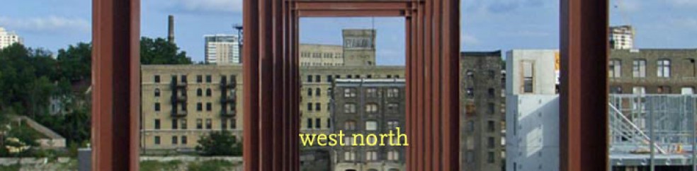
Shared streets came up a few times in discussion at Place Summit this past weekend — praised as a “complete streets” solution that’s slower, narrower, more urban, and less auto-oriented, instead of the wider roads (with bike lanes!) that many DOTs have ended up with. It turns out that the NACTO Urban Street Design Guide does offer design guidance for both residential and commercial shared streets, and for “green alleys,” their term for a shared alley.
Katherine Watkins from Cambridge, Mass. presented at the 2012 NACTO conference on her city’s experience with three shared streets — one side street and one alley off Harvard Square, and one residential street. Her presentation has photos and example municipal code clarifying behavior on the shared streets: drivers must yield to pedestrians at all times, and the speed limit is 10 MPH. The NACTO guide also mentions a residential shared street in Santa Monica.

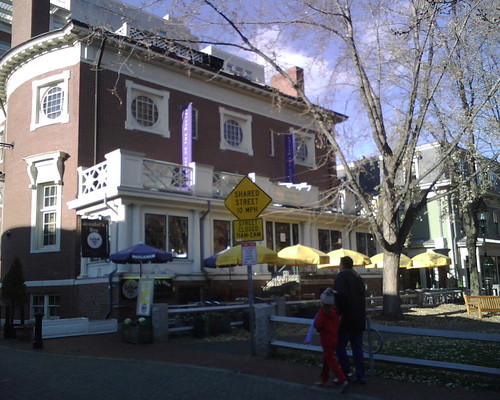
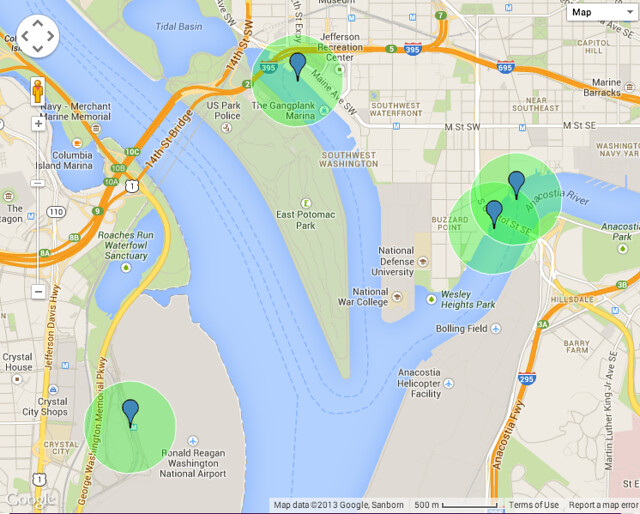
Several experiments with shared streets are underway in the Washington, D.C. area. Most famous is Cady’s Alley, a thriving destination for high-end design retailers tucked between busy M Street and the C&O Canal in Georgetown. Developers have long struggled with how to activate the deep block of former warehouses on that block (most famously with the white-elephant Georgetown Park mall) , and here Anthony Lanier, the impresario of Georgetown real estate, has successfully created an environment that simultaneously honors the area’s 19th-century industrial heritage, incorporates cutting-edge design, provides an inviting and durable pedestrian environment, and makes so much money that he’s at it again. (I didn’t know until now that Leopold’s Konditorei was a loss leader, but it could have fooled me: it’s a fantastic place-maker and a treasure.) Approval of the street design was facilitated by the fact that it’s an alley, and therefore not subject to the usual street design standards — pedestrians aren’t expected along alleys, and therefore sidewalks don’t need to be provided.
Update: DDOT proposes a shared street (see option 2, “Flex space”) as one option to improve an existing multiway boulevard’s service lane.

If all goes according to plan, Virtue Feed & Grain in Alexandria will soon sit at the intersection of two public shared streets: Wales Alley, which it recently converted into a shared ROW, as well as Union Street on the other side. Toole Design Group is leading the study process.
Other local shared streets have benefited from being built as private drives:


From top to bottom, these are the Brookland Arts Walk and Bethesda Lane, both pedestrian streets which are open only to delivery vehicles, and District Avenue at Mosaic in Fairfax County, a more conventional street that happens to be curbless. On a much larger scale, the Wharf, a 3.2 million square foot mixed-use development, promises that all of its internal circulation will be along shared streets. (Both the Wharf and Georgetown have to undergo federal review, via the Commission on Fine Arts.)
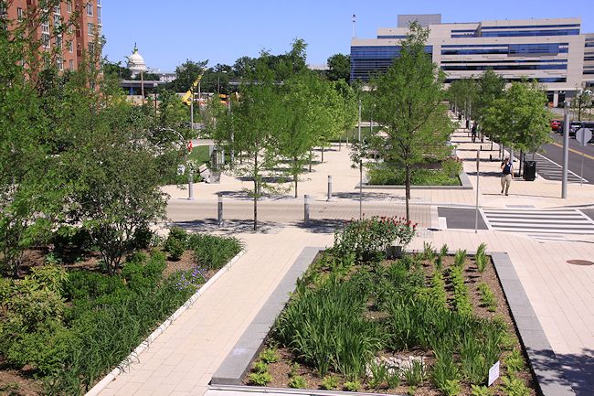
Perhaps more interestingly, Washington Canal Park, across from the US DOT headquarters, converted the two side streets running across the site into curbless streets with lighted bollards. OLIN was the landscape architect for this Sustainable Sites Initiative pilot project.
A few other experiments have occurred around the country:

Market Square in Pittsburgh (PPS-inspired redesign)

Flanders Festival Street in Portland’s Chinatown (technical summary by Ellen Vanderslice for ITE)

In Columbus, Ohio, Pearl Alley went from being a convenient cut-through (in a city of excessively wide streets), to a popular summer farmers’ market, to a small-scale retail artery along a shared street.
Of course, they’re also very common outside the United States, including:

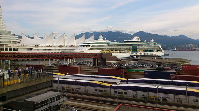
Vancouver, B.C, where this woonerf is an integral part of what made this the first LEED ND Platinum neighborhood

Calgary, where partially re-opening a pedestrian mall was integral to its regeneration

Throughout Japan (this is in the small mountain city of Matsumoto), where shared local streets might even constitute the majority of street frontages.


![Plan of the city of Washington[...]](https://i0.wp.com/farm4.staticflickr.com/3167/2674571035_8677eb500c_z.jpg)


