Friday photos: Tokyo’s small scale, and how I learned to love Modernism

Cube

No less an authority on great streets and great cities than Holly Whyte, guiding spirit of the Project for Public Spaces, wrote in City: “But the most fascinating of Tokyo’s streets are its ordinary ones. Mile after mile, they are consistently more interesting than ours. In the Shinjuku district there are more streets to savor than in most U.S. cities put together, and for sheer sensory impact there is nothing to match its back alleys…” (And Whyte’s comparison set was NYC in the 1980s, which hardly lacked for “interesting” streets that packed in “sensory impact.”)

Narrow flatiron

Tokyo disabused me of any notion that classical architecture was integral to creating walkable, human-scaled places, or that newness per se is the problem. Japanese cities show that fascinating places can exist with mediocre 20th-century architecture. And because they’ve shown that it’s possible to build fantastic, prosperous, massive, and efficient cities in the 20th century, they’re much more powerful examples for city-builders in our time than European antiquities.

Tokyo was a megacity in the pre-industrial era: it boasted a million residents back when New York was a mere town of 50,000 cowering on the edge of a vast wilderness. But Tokyo was leveled by an earthquake in 1923, then firebombed in World War II. Unlike other societies, which would use those catastrophes as excuses to re-plat and re-organize, the Japanese rebuilt their cities with largely the same warren of narrow streets and the same itty-bitty lots, but modernized the architecture with the very latest in cement-block schlock. It’s as if Rome were rebuilt by Angelenos in the 1970s. And it’s fantastic.

Here’s just a random intersection I walked through near Fudomae station, southwest of the city center and outside the Yamanote Line “beltway,” where a friend of mine happened to let me stay in her inexpensive flat. Yet it’s quiet, livable, affordable, fascinating to walk around, and completely illegal in America due to its narrow streets, mixed uses, Byzantine street pattern, high lot coverage, and high density — in other words, its small scale.

Many smaller buildings will create a much more lively streetscape, and more opportunities for cool urban spaces, than fewer but larger buildings. The critical deficiency in American cities, by comparison, is not limited to fixing a single profession, like architecture or even engineering. Rather, our entire system is tilted towards gigantism: our suburban-era parcel sizes, our High Modern-era zoning (which almost require large buildings), our mortgages, our street design manuals, our nonsensically upside-down parking requirements.

inside the void

If the stupendous urbanism yields such terrific results in the hands of ordinary architects, it becomes sublime in the hands of masters like Tadao Ando.

Robin Harding, writing in the FT in 2016:

“At the level of individual buildings, if you block from your vision whatever stands next door, Tokyo fizzes with invention and beauty. It is no coincidence that the country where architects can build has produced a procession of Pritzker prize winners… The ugliness is shared by rich and poor alike. So is the low-cost housing. In London, or in San Francisco, all share in the beauty, but some enjoy it from the gutter; others from high above the city, in the rationed seats, closer to the stars.

Friday photo: Shared space, residential parking-lot edition

Sofia Lofts, San Diego, CA

The ULI Case Study that I wrote about Sofia Lofts, a 17-apartment development in a neighborhood in eastern San Diego, was recently posted. I was particularly intrigued by how the developer/architects used shared space to maximize usable open space while meeting the letter of the law with regard to parking requirements:

For the balance of the 21 [parking] spaces planned, six more garages are accessed via the courtyard. The plans show seven more spaces within the courtyard itself, immediately in front of the garages — but to keep the space inviting, the spaces in the courtyard are off limits for tenant parking. It’s a small net loss for NDD, which discounts the rent for some tenants who forgo on-site parking, but results in a common area that looks like an expansive garden, rather than a parking lot.

The materials used within the courtyard were also chosen to make the garden feel like a place where cars just happen to be allowed. Part of the driveway near the alley is paved with concrete, but the center of the property is covered in pea-sized gravel. The texture of the gravel slows down cars to walking speed, adds visual and auditory interest, and permits rainwater to filter through. Its inspiration comes from a house in Italy that the Nakhshab family lived in; as Soheil recalls, “The courtyard we would always play in had that type of gravel, and we are seeing the tenants’ children doing the same thing.”

Friday photo: Why did Chicago courtyards disappear?

anti-courtyard

Here’s my old block in Wicker Park (and namesake for this blog): the 2100 block of West North Avenue. It’s also an interesting illustration of how Chicago’s 1957 zoning ordinance made courtyard apartment buildings illegal — even though this eminently livable, passively vented building type defines high-density Chicago neighborhoods like Rogers Park and South Shore.

What did courtyards in were backyards. The 1957 ordinance (mildly updated since) requires a 30-50′ rear yard for residential units in all but the densest of downtown zones; functionally, this is where the garage went. This mandate shifted open space to the rear of the lot, and the entire point of a courtyard building is that the open space is consolidated at the center of the lot.

The 1911 C-shaped courtyard shown at lower right has minimal setbacks along the sides and rear, which results in a generous central courtyard. The 1901 3-shaped courtyard at upper left was required (by a subdivision-specific covenant and by a ‘L’ line easement) to retain front and rear setbacks, and as a result its courtyard shape is so constrained as to be almost illegible. The new buildings at lower left were required to have a rear setback (the ones at far left got a slight variance) and thus consolidate their open space at the front and rear of their lots, to the great detriment of the tiny sliver of open space that the architect sought to insert in the middle.

Other contributing factors to the demise of courtyard apartments include:

  • Parking requirements, which are difficult but not impossible to accommodate in basements. The large courtyard shown here is raised, and could have been built with parking underneath.
  • The fashion for high-rises and for deeper floorplans in general, fed by postwar technological changes — cheaper steel and concrete, improved lighting, air conditioning, elevators, etc.
  • By the time 1929 came around, appropriate sites for courtyard buildings, which required contiguous lots zoned for medium density (at the time, Chicago had three density districts, although then as now the low-density district was pretty capacious). In 1945, when construction resumed, the city’s builders had shifted their attention away from the relatively built-up lakefront.
  • Market distortions that encouraged detached single-family houses instead of apartments.

2025 update: see Steve Vance’s article!

Help, a mall ate my walk shed

Mall entrance

The entrance to Hong Kong’s airport express train is somewhere within this mall. The cross-border bus terminal entrance is somewhere else entirely, and the actual “public” spaces are completely dispiriting.

When I was a small child, John Portman-style complexes were architecture’s futuristic vision: Someday, we’d all live in hermetically sealed downtown compounds of office and hotel skyscrapers set atop multi-story podiums.

My family stayed in several of these hotels on trips; sometimes, my mom would tell me about how she, as a child in Hong Kong, had dreamed of a city of skyscrapers and layers of indoor shops, all suspended above grade so that buses, boats, and cars could fill the ground plane.

That hyper-dense Modernist vision eventually came to pass in much of central Hong Kong, fed by not only its unique geography but also by its unique private-provision model for both rail and property. There’s danger, it turns out, in putting developers in charge of your rail stations; the “gift horse” of free infrastructure comes with strings attached.

When private firms are put in charge of designing pedestrian circulation networks, they will place their values — primarily shuffling eyeballs past storefronts — over the public’s need for legible, direct links from A to B. The tremendously high value of rail access behooves developers to elbow their way closer to the station; the location imperative isn’t to be near transit, it is to be at transit; to make it not just easy, but necessary to traverse their property. And, once the development has cornered the transit station, it will seek to entrap the resulting pedestrian flows within a spiderweb of passages. As Chris DeWolf writes:

Last month, a survey of 657 Tsim Sha Tsui pedestrians conducted by urban design watchdog Designing Hong Kong revealed that 77 percent prefer using street-level crossings over footbridges and subways… “The problem is that bridges and tunnels force you into particular routes that limit your ability to take the shortest path,” says Designing Hong Kong convenor Paul Zimmerman. “People also pick attractive routes. That’s a very qualitative statement, but part of what makes a route attractive is being able to see other people, to window shop, to have an experience. With subways and footbridges that becomes quite limited.”

An early version of this phenomenon can be seen in Montreal’s underground city, the most valuable retail frontage is as close to the train platforms as possible. Thus (almost as in casinos) the developers twist and turn the corridors to herd people past the shops. Future iterations of the phenomenon will soon be unveiled at the World Trade Center mall and at Hudson Yards.

Edit 7 Jul 18: author Marion Girodo has a book of “urban mangroves,” the multilevel urbanism that crops up around metro stations in Montreal, Paris, and Singapore.

Edit 17 Jan 17: Henry Grabar in Gothamist writes of “the oculus”: “If Grand Central is a train station with some shops, the Oculus is a shopping center with some trains.”

New PATH - WTC underground passage

Want to get to the PATH, or cross West Street to get to the Hudson? You’ll have to walk down this hall, and oh by the way there are plenty of shopping opportunities.  

A similar landscape may be emerging at Tysons Corner, where the in-process retrofitted suburbia — now and forevermore ridden with alienating highways — shows little sign of ever becoming a Greenwich Village sort of urbanism with small blocks of public streets lined with small-but-tall buildings. Instead, the spatial complexity that’s emerging is of a very different, much more Portman-esque sort. Philip Kennicott writes in the Post:

The decision to elevate the stations — a far less expensive approach than burying them — may well presage this sleek new world of elevated plazas and public areas, disconnected from the ground. A new office building across from the Tysons Corner station is built atop a parking garage, so that at ground level one faces a seemingly impenetrable plinth. Already, a web of pedestrian bridges — some built by Metro, others by private developers — is emerging, keeping us safely above the world of machines and hydrocarbons and asphalt…

One wonders if you will emerge from these stations with [a] sense of pleasant surprise and rootedness in the urban landscape… Likely not. Rather, you will emerge, slightly disoriented by the ever sameness of the commercial and physical space around you, wondering for a moment if you have arrived at the right station, before your basic sense of purpose — to get home, to find a restaurant, to locate a shop — kicks in, and you begin to move by habit and instinct through a pleasantly unobtrusive world of concrete and glass that could be anywhere.

Tysons Corner Center expansion

Tysons Corner Center’s “Metro Plaza” under construction. At left, the bridge to the station, at right, the bridge to the mall.

At Tysons Corner Center, the megamall at the heart of Tysons, building a bridge keeps the distance from station to mall is 300 feet — a 1.6 minute walk. The bridge siphons customers directly into the mall, creating tremendous value in three dimensions: “You’ve got a first floor on the first floor and a first floor on the second floor, so you’ve solved the verticality problem” [of pulling mall foot traffic from the entry to different levels], Timothy Steffan, an executive for mall owner Macerich, told the Post’s Jonathan O’Connell.

This Disney-esque strategy of spiriting people directly into an immersive environment has ample precedent: in fact, Roppongi Hills, a fantastically successful redevelopment in the heart of Tokyo, also uses an elevated plaza to deliver customers from the subway onto the development’s podium. The experience for customers who drive in is akin to what Rick Caruso’s malls or skyway’d downtowns provide: parking garages deadening the street environment all around, but a fantastic public space within. Sure, bus and bike customers have to deal with an ugly exterior, but the privileged modes (driving and heavy rail) get the red carpet.

Amazingly not Portman: Plaza of the Americas

Skyway urbanism in Dallas

My first instinct is to warn “creative” policymakers to be careful what you wish for: these projects result in such high cost and complexity that the only financially worthwhile result is a giant mall. They’re so huge, boring, and bland because of private value capture. Finding room in a private developer’s pro forma to build expensive underground rail infrastructure requires selling stupendous quantities of expensive corporate real estate, which will never be cool and lively. It also requires generous, greenfield-esque parcel sizes. In the worst case scenario, the project fails, and there’s nothing worse than a white elephant in the middle of the room.

Yet as dispiriting as these initial examples are, there’s a glimmer of hope that they’ll eventually be okay. With enough time, enough density, and enough owners, even these bland malls could evolve into something interesting. Hong Kong’s experience shows how the weird linkages that result from generations of ad-hoc decisions and relentless foot-traffic flows have created a hyper-dense end result that can be beautifully complex in a postmodern, emergent-urbanism way. This isn’t immediately apparent from the workaday commercial architecture, but can be mesmerizing when expressed in diagram form — as the recent book Cities Without Ground shows (high-res image slideshow). A two-dimensional plan, or even a figure-ground diagram, is useless when expressing vertical spaces.

Hong Kong architect Peter Cookson Smith described this structure in more essentialist terms in The Urban Design of Impermanence (pg. 84; excerpt):

A cityscape of streets, internalized routes and multi-level links, even without clear articulation, is open to casual exploration, and there is little need for city form to be overly organized or pronounced in order to be legible… This underlines an essential difference between the formal framework of Western public spaces and the more diffused and informal realm of social space associated with the Hong Kong street, where the relationship between public and private spaces is less tangible, and the routes between them work just as effectively in three dimensions as in two.

Perhaps China’s homogeneity and sheer density (bear in mind this is about 1-2 orders of magnitude higher than urban America’s) might increase social trust and thus break down the hierarchy of spaces — people there feel more comfortable wandering down dark alleys. Yet perhaps we could shortcut to that future: emerging spatial technologies, like smartphone-based mapping, are quickly obviating highly legible spatial hierarchies. Customers can now just as easily find a shop hidden in the back corner of a buildings as one that shouts its presence with highway-sized signs.

Or maybe not. Toronto’s PATH system is now 40-odd years old, serves more than 100,000 pedestrians a day (so many that its closure would send downtown into gridlock), and has apparently outcompeted street-level retail spaces. It’s also a navigational nightmare of corporate sameness, according to Spacing’s Kieran Delamont:

The PATH is a mall, first and foremost. Beyond access to over half a dozen food courts, at least two massage parlours, and more sushi restaurants than I cared to count, I put it to you that, with its existing wayfinding system still in place, the PATH offers nothing especially preferable over supra-terranean navigation… It is a seemingly endless maze of mall corridors, hallways, and atriums. Unless you are a person for whom the distinctions between Jamba Juice and Jugo Juice are particularly meaningful, everything in this place feels exactly the same; with each new tunnel you encounter in here, the space expands physically while being visually constricted. Because this space lacks the distinctive landmarks that you often find above ground, there is very little to distinguish it from every other mall you’ve been in. The more of it you explore, the less it feels like you could ever remember any of it…

The balance between mall and transit network is slanted heavily towards the PATH’s commercial interests; the dominant incentive of the landowners is to keep you in their slice of the PATH, not to move you through efficiently.

What we need are architects and developers who understand that, and aren’t afraid to create more interesting, if less-legible and less predictable, places — perhaps even fractal-like, medieval-esque street plans in three dimensions.

Sai Yeung Choi St

America’s lower urban densities mean that our over-commercialized transit districts may never quite achieve this level of spatial complexity, but by golly, why not try? 

[Previous transit-station walk shed coverage: walk sheds & excessively grand rail stations, walk sheds & water transit]

Friday photo: Merchants Square

Colonial Williamsburg: Merchants Square (1920s shopping center)

The entrance to ye olde Public Parking lies immediately beyond ye ancient Bank Drive Thru… Jokes aside, Colonial Williamsburg’s Merchants Square is an interesting 1930s-era transitional exercise in proto-shopping center design. As the site’s National Register nomination notes, this development largely explains why early shopping centers on the East Coast adopted a “Colonial” dress with red bricks, white columns, and pitched roofs. I wish that more of the era’s shopping centers had taken its lead in planning, rather than architecture, and moved the parking from in front to mid-block.

On a recent visit, it was surprising to see how far retail has sprawled around Williamsburg — exacerbated, no doubt, by sales-tax revenue rivalry between the City of Williamsburg and the surrounding James City County. Yet many of the new “lifestyle shopping villages” at the outskirts, namely New Town and High Street, suffer from subpar locations and high vacancy rates, and none has emerged as the Class A champion. I wonder how a less conservatively managed Merchants Square could have grown by just one or two more blocks north or south, adapting to the town’s growing and changing clientele of students, local residents, and tourists. Alas, we will never know.

Friday photo: Georgetown Park, in memoriam

Remnant of Georgetown Park mall

The Shops at Georgetown Park opened in 1981 with one of the most exuberant postmodern interiors in DC. Its fantastical neo-Victorian atrium, accented with the requisite brass railings and stamped ironwork, was meant as an elegant escape from the busy streets outside, filled with specialty shops catering to the carriage trade. It’s strange that its loss raised not a peep in such a preservation-obsessed neighborhood, just as postmodernism is starting to gain attention from the preservation community.

This little scrap of the old atrium railing is within a tiny elevator lobby off M Street, next to Forever 21. The elevator is apparently used for Anthropologie’s loading and for its offices, but also has stops on floors that have been abandoned. One of the mall’s skylights is also intact, above the cash/wrap at H&M.

Friday photo: Globalization and the architecture of “triple echo McMansions”

Zilicun fields

Teardowns have recently been making the news in Arcadia, the suburb of Los Angeles where my aunt and uncle have lived for many years. Chris Hawthorne, the architectural critic for the LA Times, wrote that the new mansions are a curious simulacrum of grandiose European houses, carrying on a tradition as old as Southern California itself:

Yet to dismiss [the mansions] as mere eyesores would be to miss a larger story about immigration and architecture in Southern California in an age of globalization. The houses Tong and Chan design represent a triple echo. First, European architectural styles were widely copied in American suburbia, producing thousands of so-called McMansions. Then those styles began appearing in Chinese subdivisions, many of them designed and built by American firms… Their architecture is reassuring to Chinese buyers not just because it suggests American suburban plenty. It also reminds them of newly built and highly sought-after residential architecture on the outskirts of Shanghai, Beijing and Guangzhou…

In the late 1870s, Elias “Lucky” Baldwin, the city’s founder and one of Southern California’s great land barons, hired architect Arthur A. Bennett to design a guest cottage for his sprawling ranch. Bennett’s eclectic design mixed the English Queen Anne and American “stick” styles with elements of Swiss chalet architecture and references to Moorish landmarks and Chinese pagodas. The budget for the house, now part of the Los Angeles County Arboretum, was vast, making it a cottage in name only. With its high ceilings and exterior dripping with filigree, it is as much the product of eclectic architectural influence — and showy new money —- as even the flashiest Arcadia houses by Tong and Chan.

This description brought to mind the most curious buildings that I saw in China, the “diaolou” of Kaiping — the county my father (and his cousin in Arcadia) hails from. Like Arcadia’s new mansions, they look fantastically out of scale, and their mish-mash of architectural revivals certainly don’t match any classical notions of Good Architecture. But sometimes, globetrotting capital manifests itself in less-than-serious ways, and today the diaolou are considered global treasures. From their UNESCO World Heritage Site designation:

covered porch

The main towers, with their settings and through their flamboyant display of wealth, are a type of building that reflects the significant role played by émigré Kaiping people in the development of several countries in South Asia, Australasia, and North America, during the late 19th and early 20th centuries, and the continuing links between the Kaiping community and Chinese communities in these parts of the world.

The big difference between fin-de-siecle Kaiping and 21st-century Arcadia, though, is zoning. America might be “a free country” in many respects, but not when it comes to building houses, as a recent LA Times article by Frank Shyong reveals.

In yet another display of what Mike Davis called “slow-growth Know-Nothingism,” Anglos are using their superior access to the machinery of zoning and local elections to write into law their feelings about “those” people — in particular, changing the zoning code to severely restrict new houses. The people who vote today get to write laws affecting the people who will live there tomorrow, without even knowing or caring who they’ll be.

I used to live in another American neighborhood that’s filled with ostentatious mansions built by immigrants who earned their keep in questionable trades. These days, of course, those buildings are considered local treasures. I’m glad that the Yankee settlers who lived lived there in the 1870s and 1880s, farming and building simple cottages, didn’t have zoning — and thus couldn’t legislate into the built environment their sublimated panic about immigration and social change.

CNU conversations: Retrofitting suburbia, organically?

Asheville

The South Slope area just south of downtown Asheville, now known for its many breweries, had an earlier incarnation as a Motor Mile of auto-related businesses. Before the 1930s, it was mostly small houses.

Now that many cities’ favored quarters have started to run out of pre-war neighborhoods (e.g., streetcar suburbs) to gentrify, the next frontier involves mid-century neighborhoods. Yet the typical cycle of gentrification requires fully depreciated, “aged buildings”,” as Jane Jacobs wrote (and Margie Zeidler marvelously retells).

In these instances, the “aged buildings” — Levittown-era subdivisions, proto-strip malls, little office buildings — suffer from two flaws:

  • An old Modern building can be more liability than asset. The mass-produced materials of that era are often toxic and less-than-durable, and construction quality was sometimes questionable.
  • The density and connectivity are often sub-critical to create a walkable urban place. Infilling is an option, but it is by definition expensive.

Under Neil Smith’s “rent gap” theory of gentrification, these places are doomed to decay and decline until their higher use justifies full demolition and replacement — rehabilitation is hardly even justified. And given the tremendous need to backfill infrastructure, full replacement is particularly costly.

Tactical and modular approaches to infill show some promise at reducing construction costs. To reduce the costs of rehabilitation, certain smaller jurisdictions have thrived through selective non-enforcement of building codes (going beyond a “lean” approach). Even though the very notion of artist-led gentrification began with plenty of code violations, it all seems so much less romantic today.

One possible exception: industrial buildings tend to have flexible interiors, relatively central locations, and (most notably) high lot coverages. In places where their relatively poor street connectivity and access can be surmounted, relatively high job densities could be accommodated within the existing low-rise building stock.

CNU conversations: Can we build authentic, small-scale communities that subtly adapt to change?

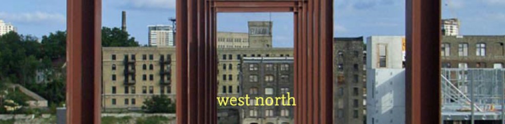
A few thoughts on a CNU 23 presentation by Russell Preston and Matt Lambert about their ongoing work on defining and fostering authenticity within New Urbanist places. Other thoughts will be forthcoming, as I write them up.

Once and forevermore

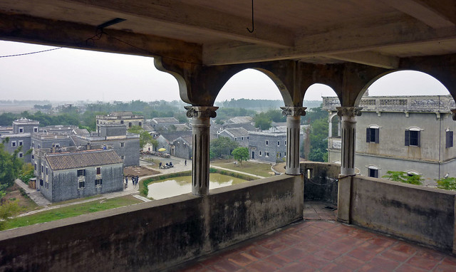
Do design and development really disrupt enduring neighborhoods? This block in Guangzhou, China, changed tremendously, but in some ways didn’t change at all.

1. Role of design
Flexible, adaptable buildings allow uses to change in their natural cycles. Crucially, notoriously fickle uses like production and retail must be given room to adapt. Not only do shop concepts and merchandise change, but the volume of these uses needed rises and falls with economic cycles. Tactical urbanism has shown us that design details may not be quite as important as broader questions of scale and program. Such a “stage set” approach may be especially appropriate in an era where programs frequently change.

2. Small scale
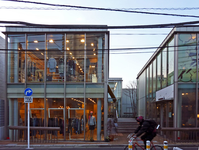
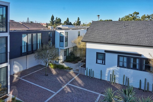
To the extent that smaller, more “honest” enterprises can be designed around, perhaps the best physical model relies on creating adaptable space along many smaller frontages — a fractal approach, as it were. More marginal businesses have long turned to side streets and passages to be near, but not in the middle of, the retail action.

Since these frontages are inherently not as valuable, they can remain affordable even amidst higher rents for premier locations nearby. Just as coach houses are “naturally affordable housing,” consider the value of alleys, passages, and even enclosed arcades as “naturally affordable retail.”

Another CNU 23 session, ostensibly about pedestrian malls, featured examples of pedestrian-only ancillary passages where smaller retailers thrive just off Main Street. Beth Anne Macdonald spoke about Division Street in Somerville, N.J., where commerce has thrived after the street was turned into a pedestrian mall in 2012. Division (like Bethesda Lane, which Tim Zork presented at the same session) was intended as shared space but ended up being car-free 24/7 — a testament to that type’s tremendous flexibility. Despite its Spartan design of concrete and streetlamps, Division is thoroughly programmed year-round.

Downtown in the distance

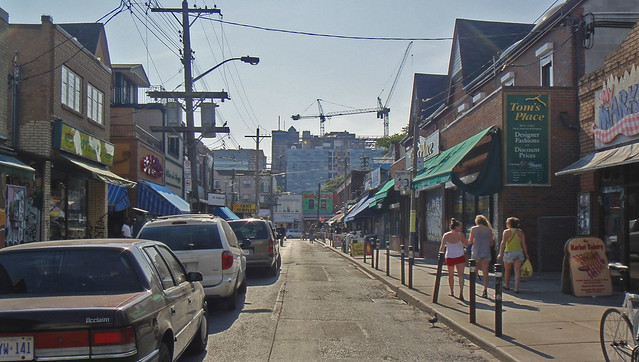
Kensington Market in Toronto has a built environment that’s a terrible jumble of everything, but it gets the scale — and thus the feel — just right. It’s car-free on summer Sundays, thanks to gates that cost just $180,000.

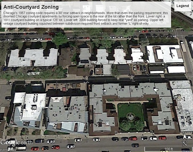
Similarly, I’m setting up a walking tour in October of how retail is thriving away from the main streets in Georgetown, along its alleys, side streets, and the pedestrian-only C&O trail. The neighborhood’s historic scale — its small blocks and small spaces — and relatively flexible zoning permits this natural shift between uses. That these processes can work illustrates two chapters in “Death and Life”: small blocks and aged buildings.

Of course, financing these spaces can be a challenge. Yet this country is plagued with throwaway retail space, much of it ancillary to upstairs office and residential. Whether the ground floor of an apartment complex is given over to “amenity space,” or to small retailers who may or may not reliably pay rent, shouldn’t be of much interest to the bankers — and, arguably, many of the apartment tenants might well prefer the latter! Designing the public and private spaces with the flexibility to accommodate whatever uses might be demanded could prove a greater challenge.

At the Louisville NextGen meeting, the one example of a new-construction informal street market that I could think of was a set of buildings in Downtown LA’s Fashion District. They appeared to have been built largely as paid parking garages, for which there are many local comparables, but had clear-span ground floors to accommodate small wholesale clothing retailers. It was awesome.

3. Policy and non-market structures
Market prices for prime space in gateway cities have — due to high outside-investor interest — reached heights that stifle innovation and organizations that evaluate their impact in primarily non-market means. Furthermore, not all institutions are lucky enough to have purchased their property “back when it was cheap.”

The 5M model (final program & renderings) has promise — identifying “community anchors” more broadly than just non-profits, offering free or discounted space to these community serving entities, and profiting by selling ancillary services. The other innovation is that this project’s pro forma has been turned on its head: the community space is accepted as a given at the starting point, and the market-rate buildings sized accordingly. (Since every development in San Francisco is discretionary, you might as well ask for the moon.)

But what about the next community that comes along? Will tomorrow’s fresh ideas and institutions have similarly protected spaces? Is this model flexible enough to accommodate new institutions, or shifting missions among the existing institutions? Rather like rent control, this approach privileges those who showed up at the right time, excludes newcomers — and leaves the question of capital renewal unanswered. Could a similar space, like [innovation] District Hall, be continually refreshed with new concepts and competitions on a regular basis?

(We had a detailed conversation about a potential corporate structure to ensure long-term community affordability on the following day. Notes about that conversation are forthcoming.)

4. Chinatowns, new
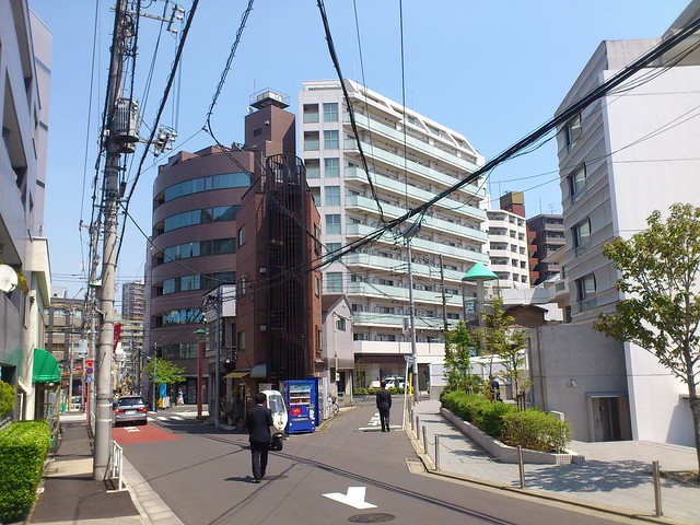
At least some suburban communities have successfully retrofitted smaller scale uses into strip-mall suburbia: the “ethnoburbs” that Asian immigrants have settled across North America. Even shiny, new buildings still foster small businesses, due in part to high density, tiny footprints (see above), management that understands the business models, and perhaps other factors that could be identified.

Meanwhile in ethnoburbia

San Gabriel, Calif.

These retail centers can be built in a more transit-oriented manner; the vertical malls cropping up around Flushing have a mind-boggling spatial complexity. The vertiginous skyscrapers of Hong Kong, clustered around mass transit, have organically evolved 3-D pedestrian networks so intricate that they defy description, but which host all sorts of authentic communities.

5. Chinatowns, old
These neighborhoods appear to maintain a remarkably stable level of economic diversity — of activities, of economic groups — and appear, from the outside, to have stable populations. Yes, some of this stability is real, and partially results from capital that gets locally recycled, through local institutions.

But what looks like stability from the outside also hides considerable turbulence under the surface. There’s constant upheaval among the community’s participants, as high in-migration balances out community members “lost” to assimilation. By and large, assimilation (as institutional racism declines/morphs) has undermined most of American cities’ other mixed-income ethnic enclaves, but since Han Chinese easily outnumber every other ethnic group in the world, there will always be a inflow of migrants — or will there?

Another less-than-replicable factor behind Chinatown’s staying power is a lack of effective enforcement (“It’s Chinatown, Jake”). Thus, things don’t quite happen to code; it’s cheaper, but somebody might get hurt. Whether that trade-off is worthwhile is your judgment call, but it does illustrate that over-regulation might be a factor in driving high costs.

6. Community change and the word “authentic”
It’s worth thinking through a bit more about how “authenticity” (see this discussion by Sharon Zukin) like any other aspect of community character, will move in cycles. Every community changes its participants, and is changed by its participants. The people who come after us have different experiences, and what we do shapes how they understand the world around them. This feedback loop can either result in a virtuous, or a vicious, cycle.

The pace of change also matters. Change is literally a fact of life, but violent upheaval is rarely welcomed. Many communities today are upset by the roller-coaster ride that property markets have put them on, with prices rising much faster than social infrastructure can adapt.

What appears authentic and novel to us will seem workaday and fake to someone else: If I cooked one of my grandfather’s recipes for you, you’d see it as “authentic” and he’d see the exact same dish as “fake.” It’s exactly that interplay, exchange, and evolution that makes cities — and especially American cities — such interesting and exciting places. It’s a tough edge to surf on, to simultaneously embrace and resist change, to honor established practices while inventing new ways, but it’s a worthwhile endeavor.

High rises’ high costs, part 3: Maintenance costs

Earlier, I’ve written about how high-rises face higher up-front costs, stemming from both lower efficiency and higher construction costs. But the high-rise cost penalty doesn’t just apply to upfront construction costs — their ongoing maintenance expenses are typically higher than for low-rise buildings.

Eastgate Village & Mercy Hospital

Even within this one development, condo fees for 1-bedroom units are 30% higher in the renovated mid-rise than in the new low-rises.

The Institute of Real Estate Management publishes an annual benchmarking report for property managers, showing average operating expenses for 717,000 apartments nationwide. IREM’s 2014 report found that “elevator” buildings (both mid- and high-rise) have operating costs that are 43% higher per square foot.

IREM apt ops data

Frank Schliewinsky, writing in Strategics Vancouver Condo Report, analyzed MLS data to find that “Monthly strata [condo] fees for low-rise projects tend to be less than those for high-rise projects.” Fees averaged 22-25% higher per unit in high-rise buildings across metro Vancouver, both in low- and high-cost markets, and both for new construction and older buildings.

(Factors that may explain the discrepancy between the two figures may relate to definitions — many low-rise buildings still have costly elevators — and/or the smaller unit sizes typical in high-rises.)

Some of these increased costs stems from the upfront construction: high-rises have more materials and bigger systems to maintain, and their less efficient floor plans mean more common areas have to be maintained.

Another curious factor is at work, though. The higher costs for high rises creates a vicious cycle: Higher costs (per square foot, and per unit) mean higher rents are needed to justify high-rise construction. Those higher rents can only be achieved by aiming for that segment of the market which wants to pay higher rents — by definition, the luxury segment, who can be enticed to pay higher costs by adding ever more amenities. Those amenities further increase costs, both up front and in the long run.

None of this is to disparage high-rises, of course: I live in a high rise, after all, and enjoy its sunlight, views, sound attenuation, and proximity to services. (And, frankly, don’t really use the high-cost swimming pool very often.) When I was younger, though, I lived in lower-cost low-rise apartments and aspired to someday live in the sky.

The intrinsically high costs of building and maintaining high-rises makes it dangerous to recommend that high-rises will absorb a large share of housing growth — particularly in metro areas that already suffer from high housing costs, which don’t need even more housing that’s inherently costly.

(Again, to be continued.)

High rises’ high costs, part 2: Land-efficient, but not floorspace-efficient

clearing

High-rises, like these in Calgary, may be land-efficient, but aren’t really floorspace-efficient.

I wrote earlier about how higher per-square-foot construction costs make high-rise housing considerably more expensive to build than low-rise housing. Those higher prices don’t stem from any one factor; costs for everything increase as buildings get taller (courtesy James Barton and Steve Watts of Davis Langdon/AECOM, in a CTBUH Technical Paper):

Elements of higher cost for high-rises

Increasing building heights doesn’t linearly decrease the cost of land per unit, as economic theory suggests, since taller buildings cost more (and in non-linear ways): they cost more to build, and they inherently waste more of their floor space.

The “efficiency” of high-rise (and mid-rise) buildings is typically lower than for low-rise buildings, and as Tom Steidl points out, especially so under American building codes. “Efficiency” in this context is an architectural term describing the “net to gross” ratio, of “rentable” or net internal area to gross internal area. As Steve Watts of Davis Langdon/AECOM points out in CTBUH Journal:

Tall buildings are less efficient than low-rise schemes because:
– Structural frames and core walls are larger and thicker
– More area is taken by plant and risers
– Smaller floor plates result in relatively high space-taken by lifts, stairs, circulation, etc.

Floorplate efficiencies of high-rises at various heights

Essentially, connecting all of the stuff above down to the ground requires taking space away from all the floors below. Every additional floor requires a tiny slice of every single floor below. The result is that 15%-25% of a high-rise’s floor area is typically wasted space. Steidl helpfully shaded these diagrams of towers in Vancouver (88.8% efficient) and Los Angeles (80.9% efficient), with net square feet in orange:

Ground-related housing types minimize this efficiency loss by eliminating interior hallways and vertical circulation. A typical Chicago three-flat achieves almost 90% net-to-gross efficiency, and every additional flat makes the design even more efficient — six flats can be accommodated with the same circulation area, yielding almost 95% efficiency. Alternate designs, like Montreal’s exterior-stair triplexes or the “Charleston triplex” (a Torti Gallas invention at King Farm that gives three flats their own internal staircases) can yield even higher efficiencies, approaching 100% — while achieving densities exceeding 30 dwelling units per acre.

Putting the two together, a high-rise unit faces a 15% efficiency penalty, and a 40% (or higher) cost penalty per square foot. The compound penalty of these two factors amounts to a 60% (or higher) construction cost premium per high-rise unit. Plus, ground-related housing can often be “self-parked,” i.e., can meet parking requirements with surface lots rather than costly multi-story parking.

What’s more, interior common areas don’t just have to be built today; they have to be maintained tomorrow — a subject for another post.

On definitions: equitable communities, magpie infrastructure, vibrant centers, gentrification

Bellevue goes upscale

Bellevue was not one of the “suburban vibrant centers” examined for a NAIOP report on office occupancy trends.

Some recent reports left me appreciative of their aims and ends, but not exactly how they got there, and in particular with how other analyses have defined key terms.

1. The Living Community Challenge certainly provides an inspiring goal to reach for, notably in its use of elegant performance criteria that broadly require “net positive” environmental performance on site — broadly, that new developments can strive to shrink their ecological footprints to fit within their actual footprints. It also pretty seamlessly integrates the Transect throughout, and in a balanced way that sometimes rewards and sometimes penalizes both ends of the spectrum.

However, having participated in the creation of LEED for Neighborhood Developments, it’s telling that some of the same battles in that scheme have emerged within this one. Prescriptive approaches still occur throughout, and some of the personal-health ones are somewhat wishy-washy. (The emerging science of health impact assessments may have been a useful complement here.) The equity section (“petal”) has a lovely intro, but its imperatives don’t address many social criteria — affordable housing is a notable omission — and almost entirely use prescriptive standards. Another long-running debate was over the use of prerequisites in the rating scheme: It seems strange that a baseline, “Petal Community” certification can be done while ignoring a majority (four of the seven) of the petals.

I’ll be interested to learn more about the Challenge in the coming weeks, and to see how others feel about whether it’s rigorous and balanced.

2. Kriston Capps brings up Mikael Colville-Andersen’s term “magpie infrastructure” in a recent CityLab piece. Bicycle and pedestrian infrastructure, examples like the Bloomingdale Trail aside, rarely needs architects’ attention — their structure-first solutions are usually fundamentally anathema to bicyclists’ lazy inclination to not climb hills. By and large, people should be encouraged to stay at grade, and landscape architects and engineers should be entrusted with their care.

Closer to MCA’s home, the current BIG exhibit at the NBM includes Loop City (video; skip to 2:30), a proposal for an elevated rail loop around Copenhagen + Malmo. The proposal lifts up the stations so that trains decelerate on the approach and accelerate as they exit — a clever idea lifted from subways like Montreal’s. When done below-ground, this brings trains closer to the surface just where they’re needed, but when above-ground, the same approach antagonizes the energy needs of the passengers (who need to climb ever-higher escalators to get to the platforms) and the energy needs of the trains.

Another obvious flaw is that the proposal repeats the Corbu-in-Algiers mistake of thinking people would want to live in flats beneath a railway, without realizing that below-the-tracks spaces are almost always only valuable in situations (I’m thinking in Ginza, the Viaduc des Arts, or 9 de Julio) where such space is just the cheapest way of getting valuable ground-level, street frontage. Even maglevs are pretty awful to stand right underneath.

Besides, haven’t we tried grade-separation of different modes before?

3. NAIOP recently published a report offering slight encouragement to the notion that office users are increasingly choosing mixed use environments — namely, 24-hour CBDs and 18-hour “suburban vibrant centers” (their terminology, not mine) — over single use suburban office parks. Their findings indicate that rental rates are indeed higher in CBDs, but that CBDs haven’t seen as much absorption as suburbs, whereas “vibrant” parts of suburbs had a verifiable edge in the leasing market. There’s certainly plentiful anecdotal evidence, and this has been the mantra of “Emerging Trends” and other qualitative reports for quite some time, but I’ve seen few attempts to quantitatively analyze the phenomenon.

Yet the two sets were compared quite differently. The comparison of CBDs vs. suburbs was strictly quantitative, an approach that didn’t control for the quality of the urban environments — downtown absorption was hurt by including a great many “dead” downtowns (Dayton, St. Louis, Hartford) among the comparison set. Most of the liveliest downtowns have seen strong positive absorption, since it’s less the CBD location than the mixed-use amenities that draw users.

The “vibrant centers,” on the other hand, were compared using a robust paired-case approach: single-use suburban areas were paired with mixed-use suburban areas within the same part of town. They even came up with a pretty strict definition of such centers and their comparison sites, using Walk Score and building-level maps. This better methodology dives into why people are migrating towards such sites, and goes beyond the not-terribly-nuanced submarket definitions found in typical office market reports.

Although the lower absorption figures for CBD office may look discouraging at first glance, it’s necessary to consider both that higher rents might result in tenants using CBD space more economically. Square feet don’t necessarily correspond with people, much less dollars. (Edit 26 Feb: City Observatory has a new report indicating that job growth has indeed been more robust in CBDs than in suburbs.) In addition, the supply constraints on new downtown office might suppress demand from space-hungry users — e.g., many large companies are expanding both in San Francisco and Silicon Valley, but adding more jobs in the Valley where construction isn’t limited by constraints like Prop M.

4. For good measure, here’s one instance where the methodology and the results both turned out okay: Governing’s recent analysis of gentrification at the Census tract level. The scale of the analysis is correct, the results pass the smell test, and the variables used (rankings of changes in household income and physical [home values] and cultural capital [college attainment]) seem reasonable.