
Kentlands just hosted its 25th anniversary celebration, a milestone that now firmly places it among the various New American Towns that dot the lower Potomac valley. In this time, what has New Urbanism accomplished, and where does the future lie? Two perspectives, both from the vanishing world of print-only publications, are excerpted below.
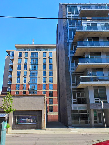
New mid-rises in Toronto.
1. Spacing Magazine‘s 10th anniversary issue (which we [few] American subscribers get pretty late in the game) has a great article by Dylan Reid about “the future of urbanism,” or rather the challenges ahead:
This rise of urbanism is good. It is creating cities that are healthier, more efficient, and more sustainable fiscally and environmentally — and they are more enjoyable to live in. The fact that an ever-increasing number of people actually want to live in dense downtown neighborhoods is an astonishing transformation from two decades ago, and essential to urbanism’s success…
Urbanism’s problems don’t discredit it (although some would like them to); rather they mean that the movement needs to test, challenge, and extend itself rather than rest on its laurels…
Urbanists also need humility. The familiar urbanist solutions work in the older parts of the city and, perhaps, in concentrated blank slates like brownfields, but they won’t work out-of-the-box in the suburbs.
Reid then posits and elaborates upon ten challenges, first as statements and then as questions that elude easy answers, which I’ll quote here [with my clarifications]:
- How do we adapt and extend the benefits of urbanism to the suburbs in a way that will be welcomed?
- Can we figure out how to build avenues and greenfield neighborhoods that are vibrant?
- How do we ensure that everyone is able to enjoy the advantages of urbanism?
- How can we ensure that extending rail transit and walkability doesn’t simply push low-income households further away?
- How do we maintain viable spaces for creativity, or create new ones, in the face of gentrification?
- How do we keep small waterways without undermining the density and connections that make a city efficient and sustainable?
- How do we make sustainable local food available and affordable to everyone in the city?
- How do we maintain the role of manufacturing and food processing in our urban economy and start to integrate them into sustainable urbanism?
- How will we find the money and political will needed to fund the next waves of transit investment?
- How can we increase the number of year-round cyclists?
The list is heavy on questions of affordability, inclusion, displacement, and gentrification. While at first these might seem to be concerns primarily for fast-growing cities, they do speak to the need for urbanism to address a broader range of people, which would improve its prospects in slower growing cities as well.
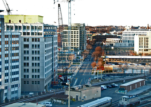
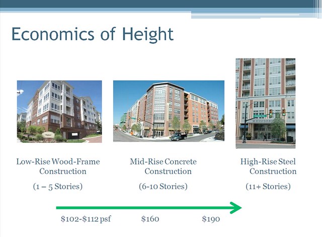
Toronto is also exemplary in its embrace of mid-rise development along mostly auto-oriented strips — reinventing the highway strip into streetcar/BRT strips — but the implementation so far has been subpar.
Lively, affordable strip malls full of independent shops are being replaced by dull condo buildings with chain stores, because the new condo retail is too expensive and often too spacious for independents, and condo boards resist all but the safest tenants… Transit is tangled in politics and not getting built. The new buildings still feel isolated rather than part of a continuing streetscape.
2. Over in the more highfalutin’ Harvard Design Review, Alex Krieger asks a similar question:
One set of ideas about good urbanism may not be sufficient. We know from experience, and from the many prefixes that we attach to the word, that across an urban region there are multiple urbanisms, hardly all conjuring up the same well-scaled, well-defined finite “urb” guarding its enduring spatial character…
What is more interesting, and found in many mature areas of urbanization, is the juxtaposition of different patterns of settlement in close proximity. Competing urbanisms may actually be a good thing for an urban region…
My intent in applauding a range of urban environments found in a metro region is to question the ferocity behind the ideological battles under way among today’s various guardians of a particular urbanism. Isn’t a proliferation of ideas about urbanization a good thing? [….]
Conversely, and equally disrespectfully, many dismiss New Urbanism as if its proponents offer no insights about cities. This too is foolish. The New Urbanism movement has raised public awareness about the social and environmental limitations of extensive suburbanization; convinced many subdivision developers to think differently about their generic layouts; pointed to outdated zoning codes that privilege single-use districts; altered the Department of Housing and Urban Development’s view on what public housing should look like and how it should be best arranged; and highlighted the “un-usefulness” of the engineering profession’s concern for optimizing the movement of cars above all. These are not inconsequential achievements for a movement that progressive architects dismiss for the sin of promoting traditional architectural imagery. Newly minted Landscape Urbanists can also be dismissive when implying that those who wish to learn from traditional urban patterns are simply Luddites…
Jacobs explains, cities are environments of not one but multiple complex problems. While not always apparent, each aspect of urban complexity is somehow interconnected to others. Planning for human settlement, therefore, requires the seeking out of both direct and subtle interdependencies prior to posing conclusions or plans… Perhaps too few of us get to page 448 in Death and Life. If we side with Jacobs (and who claims not to), then we need today’s urban polemicists to continue to offer their insight, if fewer of their universal truths — to keep jousting intellectually and, more important, to endeavor to seek out the interdependencies among their positions.
Going forward, let’s all strive to understand the multiple complexities that comprise our cities.


